
Amethyst (color): definition, color values, history and design uses
Amethyst is a moderate, slightly bluish purple named after the quartz gemstone. This article explains its color values, origins, common uses, variations and practical design notes.
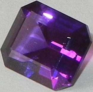
The name amethyst describes a moderate purple hue traditionally associated with the gemstone of the same name. In digital palettes it is often represented by the hex code #9966cc, a medium-light purple with a cool, slightly blue tint. The color evokes the jewel’s characteristic tones and is used in fashion, branding and interior palettes as a refined purple.
Image gallery
10 Images


Color specifications
In standard additive color notation the amethyst tone with hex #9966cc breaks down in the RGB model to approximately 60% red, 40% green and 80% blue. In the subtractive CMYK model it corresponds roughly to 25% cyan, 50% magenta, 0% yellow and 20% black. Its hue angle sits near 270° with moderate saturation and lightness values that place it between lavender and true violet.
The color’s English name derives directly from the gemstone amethyst, a variety of quartz. Historically the stone was prized for its purple color; the Greek root amethystos is commonly explained as "not intoxicated," a folkloric association that influenced the gem’s symbolic meanings. The mineral itself can vary in color intensity and is not always purple.
Uses and variations
Amethyst as a color is versatile: it appears in clothing, cosmetics, packaging and web design where a calm but rich purple is desired. Lighter, more pastel versions are often described as lavender or lilac, while deeper, more saturated tones may be called deep amethyst or royal purple. Designers frequently pair the hue with neutral grays, soft greens or warm metallics for contrast.
- Branding: conveys luxury or creativity without the intensity of red.
- Interiors: used as an accent wall or in textiles to introduce color without overwhelming a space.
- Fashion and cosmetics: flatters many skin tones when used in accessories or eye makeup.
When choosing amethyst for digital projects check contrast and accessibility, as medium-light purples can fall below recommended contrast ratios on pale backgrounds. For precise reproduction use the stated hex and RGB values and test across devices. For further reading on visual color standards and related tones, see resources on amethyst and related shades like lavender.
Notable distinctions include the difference between the gemstone and the color: the mineral can show zoning, inclusions or colorless specimens, whereas the color term refers only to a consistent hue used in art and design. If you need consistent printing results, convert the hex to specific CMYK values for your print profile rather than relying on on-screen appearance.
Related articles
Author
AlegsaOnline.com Amethyst (color): definition, color values, history and design uses Leandro Alegsa
URL: https://en.alegsaonline.com/art/3530