
Initial — drop caps and letter initials in writing and typography
An initial can mean a decorative drop cap used in typography or the first letters that abbreviate names and terms; this article explains forms, history, uses, and style distinctions.
An "initial" has two common senses in written communication. In typography it refers to a large or decorative letter that begins a paragraph, chapter, or section (a drop cap). In editorial and everyday use, "initials" are the first letters of words — typically personal or organizational names — used as abbreviations. The term derives from Latin initialis, meaning "standing at the beginning"; its uses today span design, record keeping, and identity.
Image gallery
10 Images


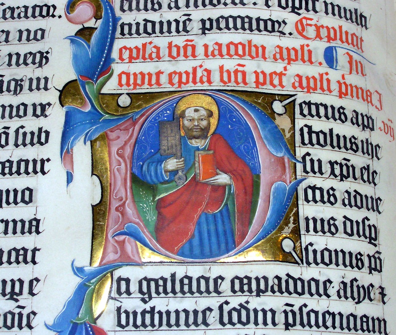


Typographic initial (drop cap)
A typographic initial is a single enlarged character set at the start of a block of text. Designers employ drop caps to signal the opening of a narrative unit such as a chapter or to add visual emphasis to a paragraph. Drop caps may be plain, ornamented, or "historiated" — containing miniature scenes — and are sized to span several lines of body text. Modern page layout achieves this effect with typesetting software and web techniques that control the first letter's scale and positioning.
History and development
Decorative initials have roots in hand-copied medieval manuscripts where scribes and illuminators added elaborate letters to mark important openings; see examples in illuminated manuscripts. From the Middle Ages through the Renaissance, initials were focal points of decoration and meaning, sometimes colored or gilded during rubrication and often historiated. With the invention of printing, block initials were cast in type and later revived in book and magazine design; the practice persists in digital typography today.
Initials as abbreviations and monograms
Separately, "initials" identify people or entities by their first letters: e.g., JFK or corporate marks. Linguistically, initials differ from acronyms (pronounced as words) and initialisms (spoken as individual letters) — though common usage often blurs those categories (see distinctions). Style guides vary on punctuation: some prefer periods (J.F.K.), others omit them (JFK); cultural and institutional conventions influence the choice (punctuation).
Uses, examples, and conventions
Initials serve practical purposes: shortening long names for signage, branding, legal documents, and indexing. They form monograms for personal stationery, are used as logos for organizations such as USA or municipal abbreviations like NYC, and appear in media shorthand (for example KUWTK). In many writing systems and cultures, placement and order of initials follow different rules (surname-first vs given-name-first).
Practical distinctions and best practices
Designers should balance ornament and legibility when using typographic initials; excessive decoration can hinder reading. Editors and communicators should follow relevant style manuals for abbreviation, capitalization, and punctuation. Quick distinctions: a "drop cap" is a visual, typographic device; an "initial" as letters is an abbreviation or identity marker. For additional technical and historical resources consult specialist references and style guides via the links provided.
Related articles
Author
AlegsaOnline.com Initial — drop caps and letter initials in writing and typography Leandro Alegsa
URL: https://en.alegsaonline.com/art/47365