
Helvetica: the neo-grotesque typeface and its influence
Helvetica is a widely used neo-grotesque sans serif typeface family, created in 1957. Noted for neutrality, many weights and global use in signage, branding, and design, it shaped 20th-century visual communication.
Overview
Helvetica is a neutral, sans serif typeface family originating in the late 1950s. Designed to be clear, legible and formally restrained, it quickly became a standard in graphic design, corporate identity and public signage. Its restrained aesthetic has made it a go-to choice for designers seeking an unobtrusive, modern look.
Image gallery
10 Images


Design characteristics
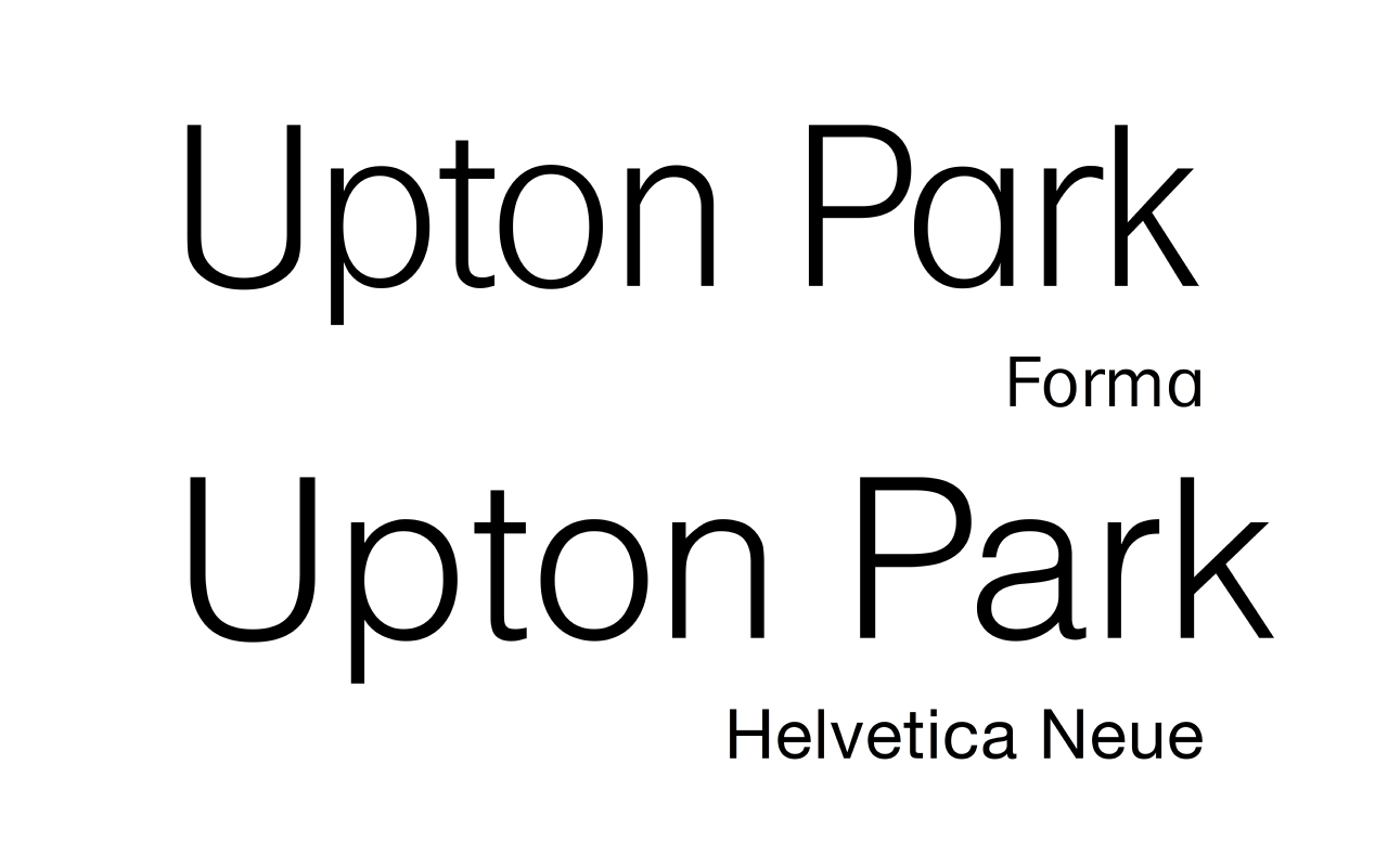
Classified as a neo-grotesque or realist face, Helvetica shows the following traits:
- Relatively high x-height and compact letterforms that aid legibility at small sizes.
- Tight spacing and nearly uniform stroke widths, producing an even color on the page.
- Short, horizontal terminals and a minimal contrast between thick and thin strokes.
- A generally neutral, functional appearance intended to avoid decorative expression.
History and development
Originally released by the Haas Type Foundry in 1957 under the name Neue Haas Grotesk, the design was created by Max Miedinger with input from Eduard Hoffmann. In 1960 a wider release and licensing by Linotype led to the adoption of the name "Helvetica," derived from Helvetia, the Latin name for Switzerland. Over the decades the family has been expanded into many weights and widths and adapted for different technologies, including phototypesetting and digital fonts.
Uses and cultural impact
Helvetica has been widely adopted across industries: from corporate identity systems to wayfinding and government signage. Its perceived neutrality made it especially popular for logos, annual reports and transit information where clarity is essential. At the same time it has been the subject of debate among designers—praised for its versatility but sometimes criticized as ubiquitous or bland.
Variants, licensing and further reading
The typeface exists in many licensed versions and revivals, with variants tailored for print, screen and signage. Designers can choose condensed, extended and multiple weight families to suit different applications. For specimens and licensing details see the family pages, for example Helvetica specimens and licenses, and for broader historical context consult general typography resources such as typography references.
Related articles
Author
AlegsaOnline.com Helvetica: the neo-grotesque typeface and its influence Leandro Alegsa
URL: https://en.alegsaonline.com/art/43440
Sources
- acumin.typekit.com : "A Neo Grotesque Heritage"
- shinntype.com : "Uniformity"
- paulshawletterdesign.com : "Helvetica and Univers"