
Peach (color): description, history, uses and variations
Peach is a pale, warm tint between orange and pink, named for the fruit; used in design and fashion for its soft, approachable warmth. Origins as a color name date to the late 16th century.
Peach is a soft, warm color that evokes the flesh of the peach fruit. It sits between pale orange and pink on the visible spectrum and is typically described as a light, slightly warm pastel. The name comes from the edible peach; for information about the fruit itself see peach (fruit) and related horticultural topics at peach resources.
Image gallery
3 Images

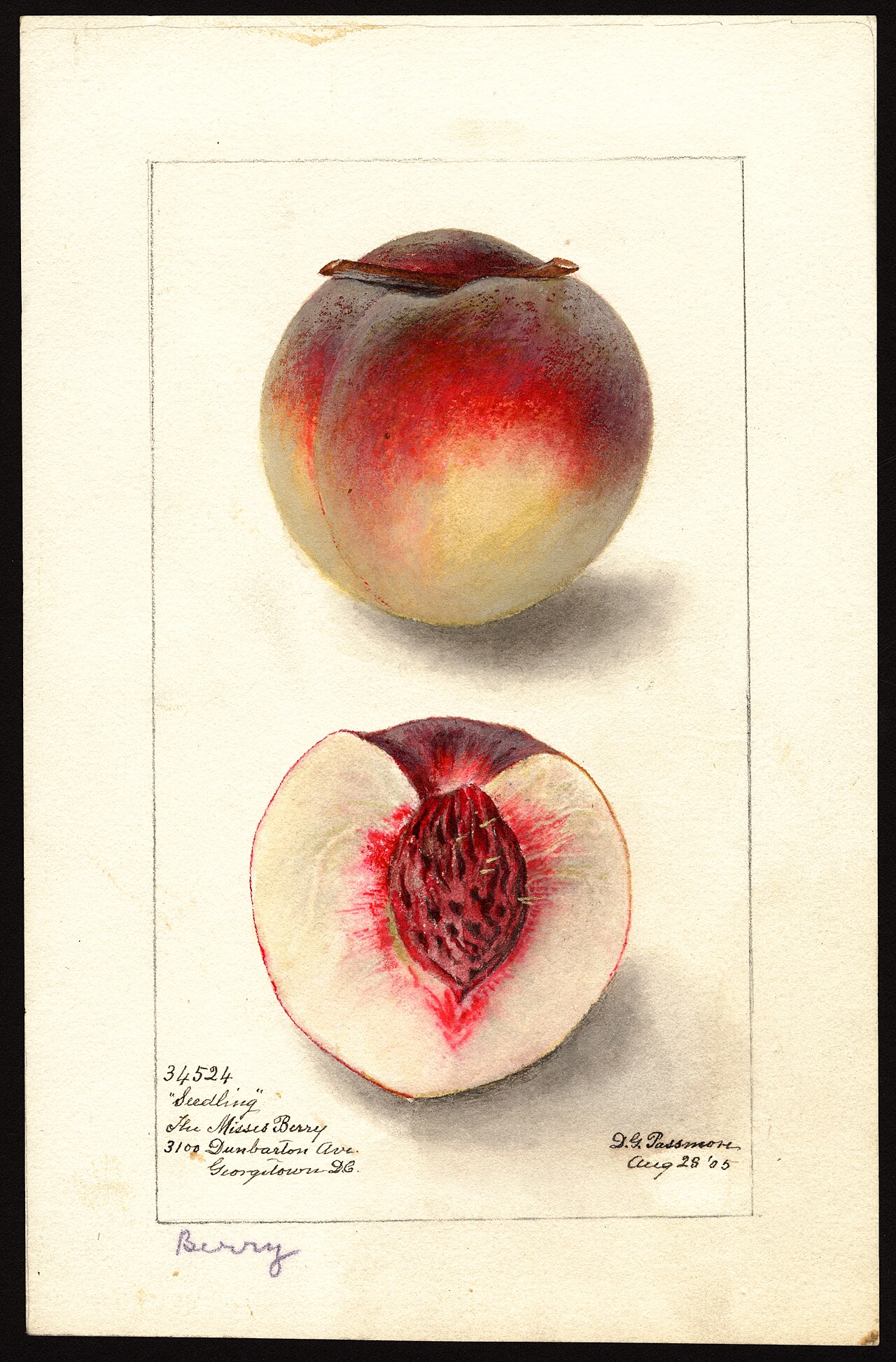
Characteristics
Visually, peach ranges from very pale, nearly creamy tones to richer, more saturated shades with obvious orange or pink undertones. In paint, an easy mixing approach is to combine orange pigment with white to achieve a lighter, softer version; see practical notes on mixing at peach paint and tips for adjusting warmth at white paint mixing guides. In digital media designers often aim for a balance between hue, saturation, and brightness to keep peach readable and pleasant.
History and name
The use of peach as a descriptive color in English goes back several centuries; the first recorded written instance of the term used to denote a color appears in the late 1500s, around 1588, marking its entry into English color vocabulary. For historical citations and linguistic context see color name history.
Uses and cultural associations
Peach is popular in interior design, fashion, cosmetics, and branding when a designer wants to convey warmth, softness, approachability, or subtle femininity without the intensity of pure pink or bright orange. It appears in fabric, wall paint, graphic design, and product packaging. Common uses include nursery decor, spring and summer apparel, and beauty products where a gentle, flattering tone is desired.
Variants and notable facts
- Variations include very pale ivory-peach, true peach with balanced orange–pink, and deeper coral-tinged peaches.
- Peach coordinates well with neutrals, soft greens, muted blues, and warm metallics for a sophisticated palette.
- Because perceptions of color vary by light and material, samples or swatches are recommended when making final color decisions.
As a gentle, inviting hue, peach remains a versatile choice across decorative and commercial applications. For technical or horticultural information tied to the fruit that lent the color its name, consult the linked resources above.
Related articles
Author
AlegsaOnline.com Peach (color): description, history, uses and variations Leandro Alegsa
URL: https://en.alegsaonline.com/art/75335
Sources
- commons.wikimedia.org : Peach (color)
- books.google.com : Google Book Result—Chinese mythology A to Z by Jeremy Roberts:
- 07517175d.blogspot.com : Fashion Color Trend Sunday, September 14, 2008: