
Tube map (London Underground diagram)
Schematic map of London's rail and transit network. Uses simplified geometry and colour-coded lines to aid navigation. Originated with Harry Beck; maintained by Transport for London and influential worldwide.
Overview
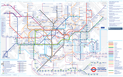
The Tube map is the schematic diagram most commonly used to navigate London's public rail services. It represents the London Underground together with several connected networks and services in a simplified, colour-coded form. An online or printed version is often called the Tube map, and many stations display a copy to help passengers choose routes and changes across the city of London.
Image gallery
7 Images


Design and characteristics
Rather than showing precise geography, the Tube map uses a topology-first approach: routes are drawn with straight segments and gentle angles so they are easy to follow at a glance. Lines are coloured distinctively to identify services; interchanges and termini are marked with recognisable symbols. This schematisation emphasises connectivity and sequence of stations rather than exact distance or direction, making the map useful for planning journeys on complex networks.
History and development
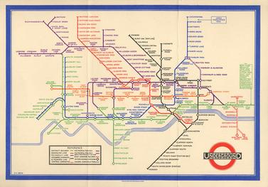
The modern schematic form became widely known after a radical redesign in the early 20th century. A crucial milestone was the diagram that introduced simplified geometry and a clean, readable layout; that style was refined over subsequent decades. The map has evolved to incorporate new routes and operators: services such as the London Underground, the London Overground, the Docklands Light Railway and additions like the Emirates Air Line cable car have been added to provide an integrated view. Responsibility for producing and updating the official diagram rests with Transport for London, which issues regular revisions to reflect network changes and service patterns.
Uses, importance and influence
The Tube map serves multiple purposes: it is a navigation aid for commuters and visitors, a planning tool for journey routes and transfers, and a public information device at stations and online. Its clear visual language has been widely imitated and adapted by transit authorities around the world for metro, tram and bus diagrams. Designers and cartographers study the map as a classic example of information design where clarity and speed of comprehension take precedence over exact scale.
Characteristics, common features and variations
- Colour-coded lines that correspond to named or numbered services.
- Standardised symbols for stations, interchanges and termini.
- Zone markings and labels that assist with fare and ticketing decisions.
- Specialised variants: tourist editions, night-service maps, and accessibility-focused diagrams showing step-free routes.
Criticisms and notable distinctions
Because the Tube map deliberately distorts geography, critics note that it can mislead users about walking distances and relative positions of places; for that reason, complementary geographically accurate maps are sometimes provided for surface navigation. Nevertheless, the schematic approach prioritises the practical needs of travelling on a dense rail network and remains the most effective format for rapid route-finding. Its role in shaping modern transit mapping is often highlighted in discussions of graphic design and urban mobility.
Further reading and resources
Official, updated versions and downloadable formats are available from the organisation that maintains the map: Transport for London. Historical retrospectives and analyses of the map's design are available in design literature and transport history collections; many online and printed sources explore how the map's principles were adapted worldwide. For network-specific details consult the pages for the London Underground, the London Overground, the Docklands Light Railway and local travel guides to London. A general access point for map files and updates is often labelled simply as the Tube map, and archival references can provide historical context for design changes over time.
Related articles
Author
AlegsaOnline.com Tube map (London Underground diagram) Leandro Alegsa
URL: https://en.alegsaonline.com/art/101926