
Cool colors: meaning, characteristics, uses and common shades
An overview of cool colors — hues that evoke coolness and calm — their traits, history in color theory, practical uses in design and art, and common blue, green and cool-white examples.
Overview
Cool colors are hues commonly perceived as calm, clear, or cold. In visual arts and design they are contrasted with warm colors and are used to suggest distance, serenity, or freshness. For a general explanation of how artists and designers think about temperature in color, see color temperature. The term also evokes the sensation of cold when color is used to create mood.
Image gallery
5 Images
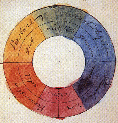


Characteristics
Typical cool colors include blue, green, and certain tones of white. They tend to recede visually, making spaces appear larger, and are often described as soothing or clinical. Cool colors can be strong and saturated or muted and soft; their effect depends on value (lightness) and chroma (intensity).
History and theory
The distinction between warm and cool hues goes back to classical painters and was formalized in modern color theory. Artists use this division to organize palettes and convey spatial depth. Over time designers and psychologists have documented common emotional associations: cool palettes are linked with calmness, professionalism, and natural elements like water and foliage.
Uses and examples
Cool palettes are popular in interior design to create restful bedrooms and calming offices, in branding for technology and healthcare to suggest reliability, and in art and film to set mood. Combining cool tones with small warm accents can produce contrast without overwhelming the overall calm quality.
Common shades
- Sky blue, ocean blue and teal — variations of blue often used for depth.
- Mint, emerald and seaweed — green family hues useful for natural or fresh looks (green).
- Cool white and icy tints — whites with blue or green undertones (white).
- Slate and steel greys — neutrals that read as cool when mixed with blue undertones.
Notable distinctions and tips
Not every pastel or light hue is warm; a pale blue remains cool. Whites and greys can read warm or cool depending on undertone and surrounding colors. Consider ambient light and cultural context: perceptions of coolness vary by lighting and by viewer. When testing palettes, view swatches in the room and alongside possible accent colors to ensure the desired emotional and spatial effects.
For practical inspiration and technical guidelines consult design references and color tools available through reputable sources such as color theory guides and manufacturer palettes (lighting and temperature, blue examples, white choices, green swatches).
Related articles
Author
AlegsaOnline.com Cool colors: meaning, characteristics, uses and common shades Leandro Alegsa
URL: https://en.alegsaonline.com/art/22889