Complementary color
Pairs of colors that contrast because they lie opposite each other on a color wheel; definitions differ between light (additive), pigment/printing (subtractive), and perceptual color models.
Overview
Complementary colors are two hues that produce strong contrast and, in many color models, are positioned opposite one another on a color wheel. When placed side by side they increase perceived brightness and vividness; when mixed they can neutralize each other toward gray, brown or white depending on whether light or pigment is combined.
Image gallery
10 Images


Color models and definitions
The exact complementary pair depends on the model being used. In additive (light) systems based on red, green and blue (RGB), complements combine to produce white light. In subtractive systems used for pigments and printing (CMY or CMYK), complementary relationships relate to absorption and reflection of light. In many digital tools a complement is defined simply as the hue 180° away on an HSL/HSV wheel.
- Additive (light): red ↔ cyan, green ↔ magenta, blue ↔ yellow.
- Subtractive (printing/pigment): cyan ↔ red, magenta ↔ green, yellow ↔ blue.
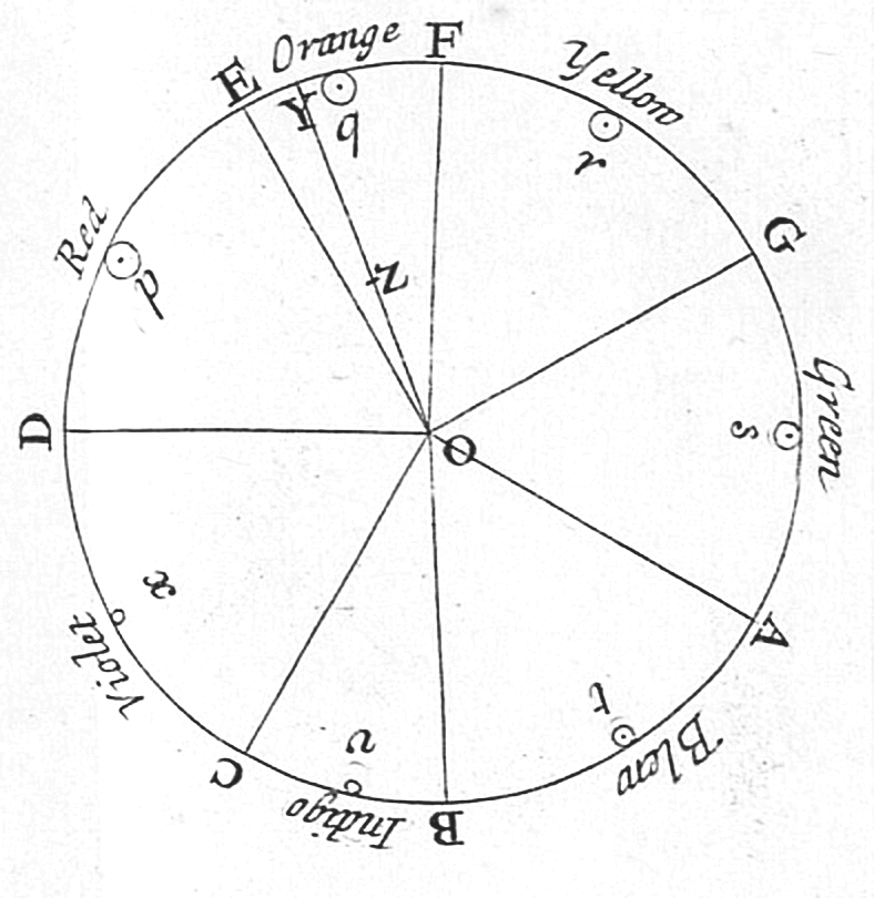
- Traditional painter's wheel (RYB): red ↔ green, blue ↔ orange, yellow ↔ purple.
Perception and optical effects
Human vision amplifies contrast between complements through simultaneous contrast: a color surrounded by its complement appears more saturated. The visual system also produces complementary afterimages—staring at a color for a time then looking at a neutral surface produces a brief image in the opposite hue. These perceptual phenomena make complements powerful tools in composition and visual communication.
History and theory
Concepts of complementarity appear in early color wheels and treatises. Isaac Newton’s experiments with prisms led to circular arrangements of hues; later observers such as Goethe, Michel Eugène Chevreul and Bauhaus teacher Johannes Itten explored psychological and practical implications, especially the striking effect of complementary contrasts in art and textiles.
Practical uses and examples
Designers and artists use complementary colors to create emphasis, vibrancy and legibility—for example, blue text on orange backgrounds or yellow highlights against purple. Printers and photographers work with subtractive complements to control color reproduction and white balance; digital artists often rotate hue by 180° to find a complement for color grading and correction.
Notable distinctions and limitations
Complementarity is a useful guideline, not an absolute rule. Real pigments seldom mix to a pure neutral because of impurities and differing spectral properties. Perceptual complements can differ from mathematically calculated opposites, and color-blind observers may not perceive traditional red–green complements. Understanding the model and the viewing context is essential when applying complementary colors.
Related articles
Author
AlegsaOnline.com Complementary color Leandro Alegsa
URL: https://en.alegsaonline.com/art/22245
Sources
- pitt.edu : "Color & The Absorption Spectrum"