
Blackletter (Gothic Script): History, Styles, and Modern Uses
Blackletter, or Gothic script, is a family of dense, angular letter forms used across medieval Europe and later in print, notable for its textured appearance, regional styles, and continuing decorative use.
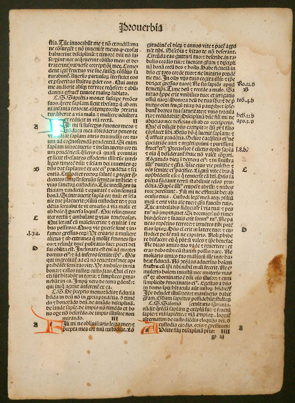
Blackletter, often called Gothic script, refers to a group of closely related letterforms used for handwritten manuscripts and early printed books. Developed in the high Middle Ages, it dominated book production in much of Western Europe from roughly the mid‑12th century until the early modern period. The same broken, compact letter shapes appeared both in writing on parchment and in printing, because early type designers modeled metal type on contemporary handwriting. Some blackletter styles remained in print in parts of Germany far longer than elsewhere.
Image gallery
8 Images



Typical characteristics
Blackletter is recognizable by a set of shared graphic features that produce a dense, textured page. Key traits include:
- Angular, often broken strokes rather than smooth curves, giving the script a 'fractured' look.
- Tightly spaced and vertically compressed letterforms that make text appear dark and uniform from a distance.
- Frequent use of ligatures and alternate letter shapes (including the long s), which affect readability to modern eyes.
- Heavy contrast between thick verticals and thin connecting lines.
Major styles and regional varieties
Blackletter is not a single script but a family with distinct regional types. Important varieties include:
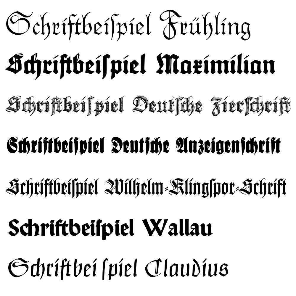
- Textura (or Textualis): very angular and dense; commonly associated with scholastic manuscripts and some early printed Bibles.
- Rotunda: a rounder southern variant used in parts of Italy and southern Europe, with less severe angularity.
- Schwabacher: a German form with more open counters, popular in the 15th–16th centuries.
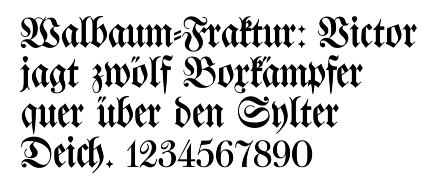
- Fraktur: a later German style with ornate details that became the dominant blackletter type in German printing into the 19th and early 20th centuries.
History and transition
The script emerged around the 12th century as scribes sought faster, more compact hands for religious and legal texts. When movable type was introduced, typefounders copied the prevalent manuscript hands so printed books looked familiar to readers; the famous early printed Bibles used blackletter‑derived types. During the Renaissance humanist movement, advocates in Italy revived simpler Roman or "Antiqua" letterforms, and over time Antiqua spread across Europe. In German‑language publishing the split between Antiqua and Fraktur shaped debates about national identity and legibility. Blackletter’s dominance faded in most places by the 17th century, though Fraktur remained widespread in German printing until the early 20th century and was officially discontinued as standard print in the 1940s.
Modern uses and notable facts
Today blackletter survives largely in display roles: book titles, certificates, newspaper mastheads, storefront signage and logos often use blackletter to evoke tradition, authority or a medieval aesthetic. It is also associated with certain music subcultures and ceremonial documents. Designers choose blackletter carefully because its dense texture and historical connotations can affect readability and tone. For background on type history and the relation between manuscript hands and printed letters, see resources on typography and the history of printing. For regional studies, consult materials about medieval scripts in Western Europe and the later use of Fraktur in Germany.
Related articles
Author
AlegsaOnline.com Blackletter (Gothic Script): History, Styles, and Modern Uses Leandro Alegsa
URL: https://en.alegsaonline.com/art/12011