Population pyramid
A population pyramid is a two-sided bar chart that displays the age and sex structure of a population, used in demography to analyze growth, aging, and social needs.
Overview
A population pyramid is a graphical representation that displays the distribution of a population by age and sex. It typically presents horizontal bars for successive age cohorts stacked vertically, with one side showing males and the opposite side showing females. The length of each bar corresponds to the number or percentage of people in that age-sex group. For a basic introduction, see population pyramid overview.
Image gallery
10 Images


Structure and how to read one
The vertical axis lists age groups (often in five-year bands), usually with the youngest cohorts at the bottom and the oldest at the top. The horizontal axis measures counts or percentages. To read a pyramid, compare the widths of bars at different heights: a broad base indicates more young people, whereas widening at older ages indicates an aging population. Analysts also examine bulges or indentations that reflect events such as baby booms, wars, or large migration flows. Further technical notes and examples can be found at detailed demographic resources.
Common types and what they mean
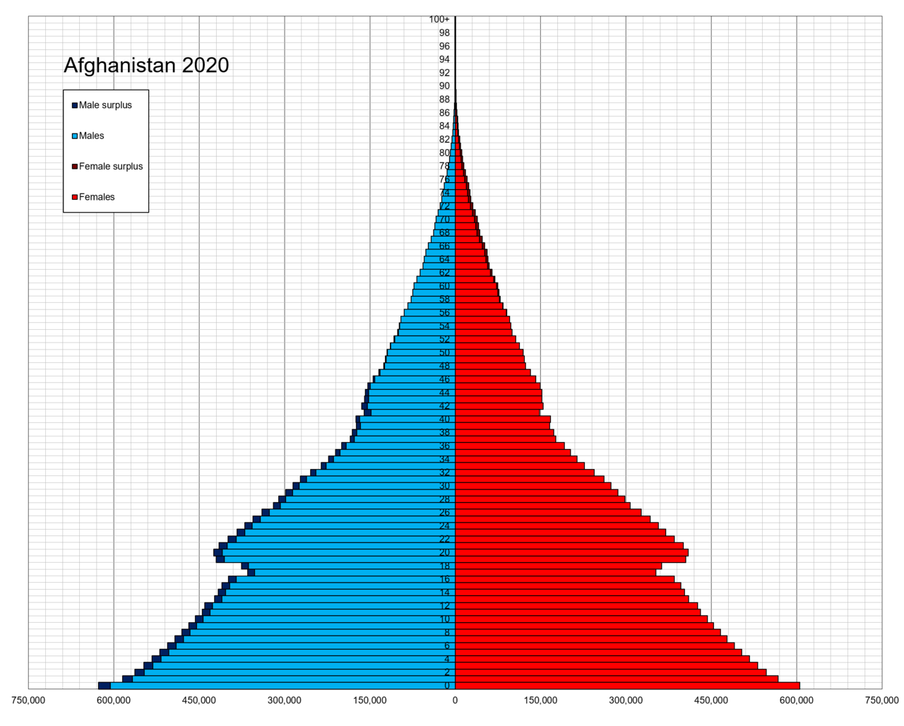
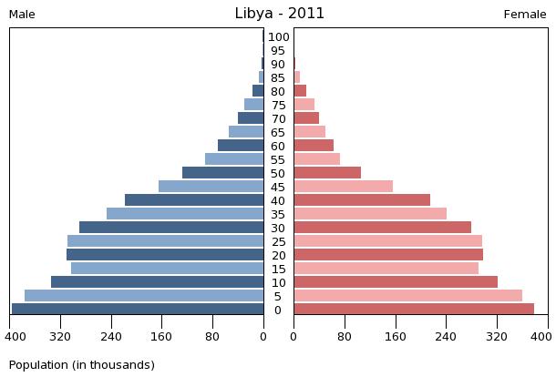
- Expansive (pyramid-shaped): A wide base and narrow top. High birth rates and relatively high mortality in older age groups. Typical of many developing populations with rapid growth.
- Stationary (column-shaped): More uniform widths across age groups with a tapering older end. Birth and death rates are roughly balanced, producing slow growth and stable age distribution.
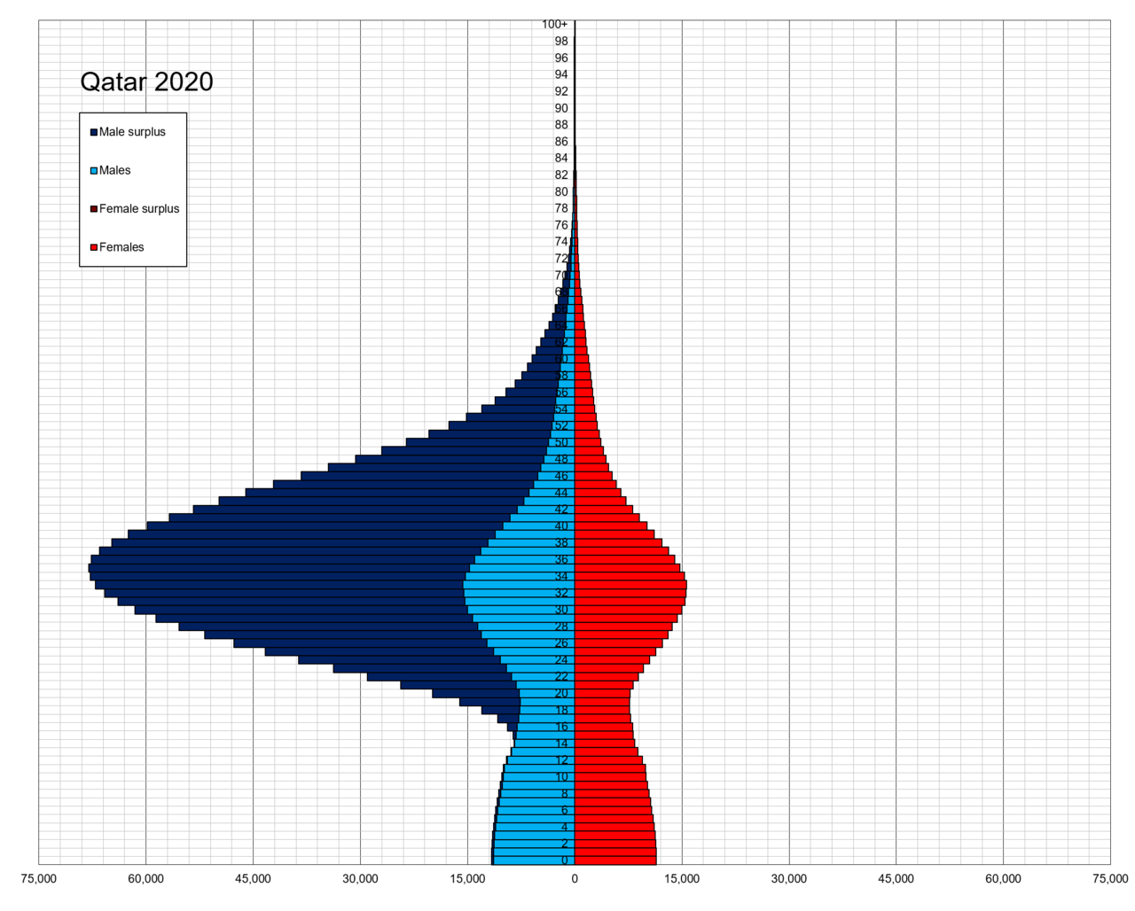
- Constrictive (inverted or top-heavy): Narrow base and relatively broader older cohorts. Low birth rates and longer life expectancy, indicating population decline or aging.
History and development
Population pyramids emerged as demographers and statisticians began collecting age-specific data in the late 19th and 20th centuries. Their use expanded with improvements in census-taking and statistical graphics, becoming a standard tool for visualizing demographic structure. Over time, refinements have included expressing data as percentages for cross-population comparisons and using cohort analysis to track groups across time. For practical guides and modern implementations see demographic visualization tools.
Uses, examples, and importance
Population pyramids are widely used by governments, planners, health agencies, and researchers. They help estimate future needs for schools, health care, pensions, labor markets and housing. For example, a country with a very broad base will have large school-age cohorts in the near future; a constrictive shape signals pressures from higher dependency ratios and pension burdens. Policymakers use pyramids to anticipate short- and long-term social and economic demands and to design age-targeted interventions. Comparative studies and case examples are available at population studies resources.
Limitations and notable considerations
While informative, population pyramids have limitations. Their accuracy depends on the quality of underlying data—census omissions, undercounting, and misreporting of age can distort shapes. Migration can produce sudden asymmetries between the sexes or particular age bands, and using different age band widths can change visual impressions. Interpreters should therefore combine pyramids with fertility, mortality and migration data to draw reliable conclusions.
In summary, population pyramids are a concise visual tool for understanding the age and sex composition of populations. When read carefully and used alongside other demographic measures, they provide valuable insight into past trends and future challenges facing societies.
Related articles
Author
AlegsaOnline.com Population pyramid Leandro Alegsa
URL: https://en.alegsaonline.com/art/78131