Isotherm — Lines of Equal Temperature
An isotherm is a contour line on a map connecting points with the same temperature. Used in meteorology, climatology and oceanography, isotherms help visualize temperature patterns, gradients, and climatological averages.
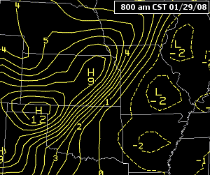
An isotherm is a line drawn on a map that connects locations sharing the same temperature value. On weather and climate charts, isotherms make temperature patterns visible across a region, revealing warm and cool zones, gradients, and fronts. Each point on an isotherm represents a measured or computed temperature, and maps normally show a legend or scale that relates colors or shading to specific temperature ranges.
Image gallery
8 Images


Characteristics and construction
Isotherms are a type of isoline (contour) and are typically smooth, curving lines rather than straight segments. They are produced by plotting temperature observations and then using interpolation and smoothing methods to draw continuous contours at fixed intervals (for example every 1, 2, or 5 degrees). Because each isotherm represents a single numerical value, two isotherms for the same value never cross one another; they may join or form closed loops.
How maps are read
On an isotherm map, the scale or legend indicates the temperature corresponding to each contour and any color bands. Closely spaced isotherms indicate a strong temperature gradient (rapid change over short distance), while widely spaced lines indicate more uniform temperatures. Maps may display instantaneous readings, daily averages, monthly means, or long-term climatological normals depending on the purpose.
Uses and examples
- Meteorology: identifying air masses and fronts on synoptic charts.
- Climatology: showing seasonal patterns and climate zones based on mean temperatures.
- Oceanography: mapping sea-surface temperatures to track currents and eddies.
- Agriculture and ecology: informing planting dates, frost risk, and species distributions.
History and related concepts
The use of contour lines to represent equal values dates back to early scientific cartography; isotherms as a specific map element were adopted in the 19th century to display temperature distributions across continents. Isotherms are one member of a family of isolines: isobars (pressure), isohyets (precipitation), and isotachs (wind speed) are similar tools that visualize different atmospheric variables.
Practical notes
When reviewing an isotherm map, consider whether the data are raw observations or averages. Point measurements can be shown directly or combined into averages using statistical techniques; mapmakers must choose an appropriate contour interval and smoothing level to balance detail and readability. For further reading on temperature measurement and mapping techniques see temperature data sources and methods for computing temperature averages.
Related articles
Author
AlegsaOnline.com Isotherm — Lines of Equal Temperature Leandro Alegsa
URL: https://en.alegsaonline.com/art/48492