
Saul Bass: Designer of Title Sequences and Iconic Corporate Logos
Saul Bass (1920–1996) was an American graphic designer and filmmaker who transformed movie title design and created enduring corporate identities, including the AT&T bell and globe marks.
Overview
Saul Bass was an American graphic designer and an Academy Award–winning filmmaker whose work reshaped visual communication in both cinema and commerce. Working from the 1950s through the late 20th century, Bass brought a modernist sensibility—clarity, economy and visual metaphor—to film title sequences, posters and corporate identities. His contributions helped establish title design as a creative discipline rather than a purely functional craft.
Image gallery
8 Images





Early life and education
Saul Bass was born on May 8, 1920, in New York City, New York. He attended James Monroe High School and studied design at Brooklyn College before beginning a professional career in graphic arts. Bass moved to Los Angeles in mid-career as he expanded into motion work and collaborations with filmmakers. His background in print and advertising informed the tight, economical visual language he later applied to moving images and identities.
Film work and notable title sequences
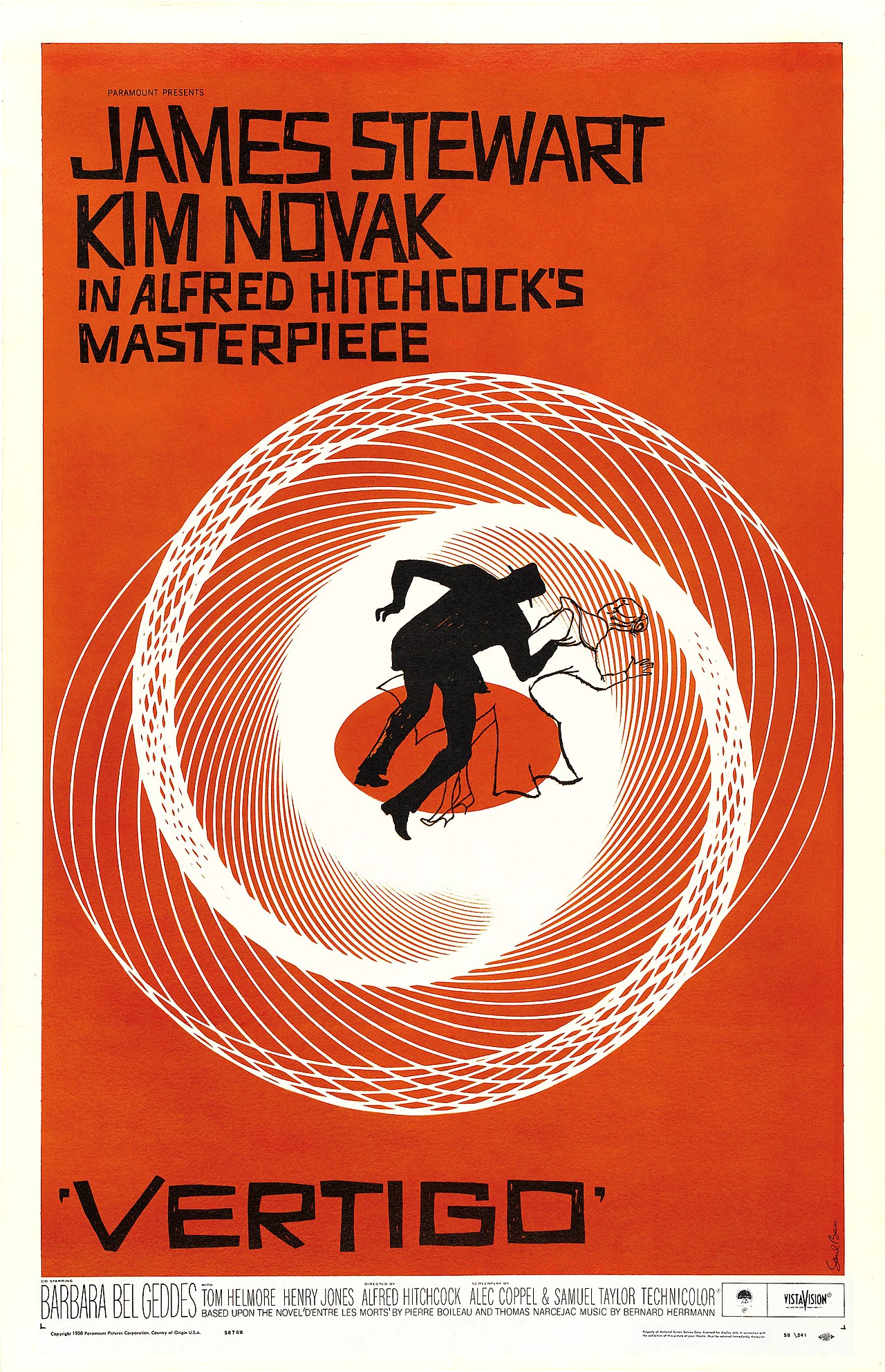
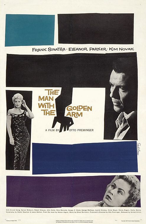
Bass began producing title sequences in the 1950s. Collaborating with directors such as Otto Preminger, Alfred Hitchcock and later Martin Scorsese, he used typography, abstract imagery and motion to set the tone for films and to suggest thematic material. Rather than serving as a mere list of credits, his sequences often functioned as a prologue—compressing mood, theme and narrative suggestion into seconds of animated graphic design.
- The Man with the Golden Arm — a jagged, rhythmical treatment that echoed the film's subject matter and emotional tension.
- Vertigo — abstract, spiraling motifs and minimalist imagery that suggested psychological unease and obsession.
- Psycho — terse, stark titles and cutting rhythm that matched the film's abruptness and tonal shock.
- North by Northwest and Anatomy of a Murder — sequences that fused typography and motion to evoke suspense and legal drama respectively.
Corporate identity and logo design
Outside film, Bass translated his reductive graphic approach to corporate identity. He created a range of recognizable marks and visual systems that emphasized a single, strong motif and readability at many scales. Among his most widely seen commissions was the AT&T bell mark, produced for the company in 1969, and a later reworking that led toward the AT&T "globe" concept; these examples illustrate his ability to create symbols that work across advertising, signage and print. Bass's work for companies and institutions demonstrated that the same principles governing good title design—simplicity, memorability and conceptual clarity—apply to brand identity as well. See examples of his corporate logos and the well-known AT&T bell logo.
Style, method and working practice
Bass's visual language emphasized reduction to elemental shapes, bold color contrasts and dynamic negative space. He treated typography not as neutral text but as a graphic element that could move, fragment or imply action. In motion work he collaborated closely with directors, editors and composers so title sequences would integrate with a film's pacing and sound. He often storyboarded sequences and experimented with cutting and animation techniques to achieve a seamless fit between the titles and the film's opening scenes.
Awards and recognition
During his career Bass received recognition from both the design and film communities. In addition to honors for his graphic work, he directed short films and received film-industry awards for his filmmaking, lending further credibility to the notion of title design as cinematic expression. His posters, title sequences and identity systems remain frequent subjects of study in design history and film courses.
Personal life and death
Bass married Elaine Makatura in 1961; the couple had two children and remained together until his death. He died on April 25, 1996, at his home in Los Angeles, leaving behind a body of work that continues to influence designers and filmmakers.
Legacy
Saul Bass's approach—to distill ideas into concise visual metaphors, to animate typography, and to align graphic impulse with narrative function—has had long-lasting influence. Design schools, museums and practitioners study his film openings, posters and corporate marks as exemplars of economy and expressive clarity. Contemporary title designers cite Bass's work as a foundation for exploring how motion graphics and typography can communicate tone and meaning before a single line of dialogue is spoken.
For visual examples and further reading, consult illustrated retrospectives and collections in design anthologies that document Bass's film sequences, poster art and identity projects; these resources illustrate how his distinctive visual strategies were applied across different media and industries.
Author
AlegsaOnline.com Saul Bass: Designer of Title Sequences and Iconic Corporate Logos Leandro Alegsa
URL: https://en.alegsaonline.com/art/130549