Times New Roman
A widely used serif typeface commissioned for The Times in 1931. Designed for legibility and space economy, it became a standard for print and digital publishing and remains common on personal computers.
Times New Roman is a classic serif typeface originally created to improve the legibility and economy of body text. Commissioned by British newspaper design management and produced for The Times, it was intended to read well at small sizes while fitting more words per column than many contemporaries. Its development emphasized clear letter shapes, relatively high contrast between thick and thin strokes, and compact proportions to conserve space without sacrificing readability; overall the design reflects a practical balance between aesthetics and function, with an explicit focus on legibility.
Image gallery
10 Images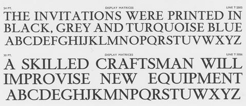


Design characteristics
Times New Roman is characterized by narrow letters, robust serifs, and a moderate x-height that helps maintain legibility in dense setting. The design permits tighter line spacing and reduced column width compared with more open serif faces, which made it particularly valuable for newspaper body copy where economy of space mattered. Typical features include distinct, bracketed serifs, sharp yet slightly condensed letterforms, and a rhythm intended to guide the eye across long paragraphs.
History and development
The face was commissioned in 1931 and credited largely to typographic consultant Stanley Morison, with the lettering artist Victor Lardent contributing drawings that formed the basis of the metal type. It first appeared in the pages of The Times on 3 October 1932. The design was later issued commercially by type foundries so that other publishers and printers could use it; over time it has been adapted for hot-metal, phototypesetting, and digital formats.
Uses, distribution, and digital life
After its introduction it quickly spread beyond newspapers into books, magazines, academic publishing, and general printing. In the digital era Times New Roman became widely distributed on personal computers and office software, appearing as a standard choice for documents and publications and remaining familiar to readers around the world. Many digital revivals and related families exist to serve screen rendering, desktop publishing, and web typography. It is commonly bundled with operating systems and office suites and hence appears on most computers in common use today.
Variants and comparisons
There are numerous versions and interpretations of Times New Roman, from metal and phototype cuts to digital revivals optimized for particular resolutions and printing processes. Designers sometimes choose alternative serif faces—such as Garamond, Georgia, or Baskerville—depending on the desired tone, readability at specific sizes, or the amount of space available. Compared with Georgia, for example, Times New Roman is generally more compact; compared with classic old-style faces it tends to show sharper contrast and a more modern newspaper aesthetic.
Legacy and notable facts
Times New Roman's longevity stems from its practical design and ubiquitous distribution. Though the original newspaper that commissioned it now uses newer headline and text typefaces in its pages, the name and the style have become synonymous with readable, conservative serif typography. The face has attracted praise for its efficiency and clarity and criticism for being overused or perceived as bland; nonetheless it remains a foundational typeface in publishing history and a common default in many software packages.
- Design intent: conserve space and maximize legibility.
- Creators: associated with Stanley Morison and Victor Lardent.
- First newspaper use: October 1932.
- Distribution: many commercial and digital versions exist for print and screen.
For further reading and technical specimens, consult primary type foundry documentation and historical accounts of newspaper typography, which explore both the original metal types and later digital reinterpretations in greater detail. Serif anatomy, typeface family development, and studies of text legibility provide useful context for understanding why this face has endured.
Related articles
Author
AlegsaOnline.com Times New Roman Leandro Alegsa
URL: https://en.alegsaonline.com/art/99965
Sources
- typolis.de : "Times New Roman"
- magazines.iaddb.org : "Times New Roman"