Typeface (typography): definition, structure, history, and uses
A typeface is a coherent family of letterforms sharing design traits. This article explains what typefaces are, how they differ from fonts, their parts, history, common uses and notable variations.
Overview
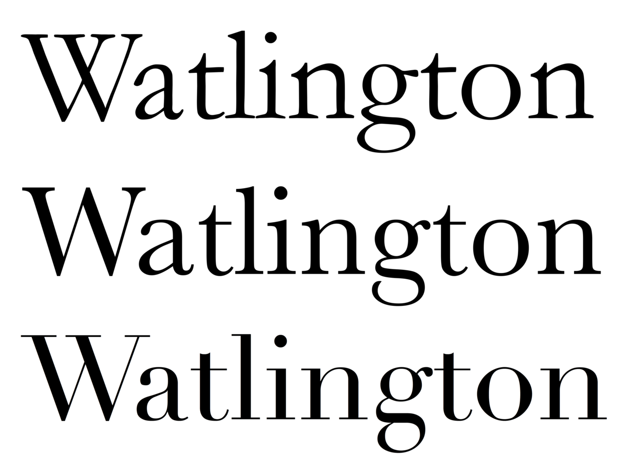
A typeface is a cohesive set of letterforms, numerals, punctuation marks and symbols that share a consistent visual design. In practical use a typeface appears as one or more fonts: individual files or styles that specify size, weight, width and style for digital or physical printing. The distinction between a typeface and a font is important for designers: a typeface is the conceptual family name while a font is a specific member of that family. For a general introduction to the broader field see typography.
Image gallery
10 Images


Structure and characteristics
Each character in a typeface is a glyph, a single visual unit representing a letter, number, mark or symbol. A typeface may supply multiple glyphs to cover different languages, ligatures, alternates and stylistic sets. Common attributes that vary between fonts in a family include weight (light to bold), width (condensed to extended), posture (upright to italic) and optical sizes tuned for different point sizes. For more on glyph design see glyphs.
Designers also consider spacing and metrics: kerning adjusts space between pairs of glyphs, tracking changes overall letter spacing, and leading sets vertical spacing between lines. Legibility and readability are primary goals when choosing or creating a typeface; for discussions of clear text presentation consult resources labeled legibility.
Classification
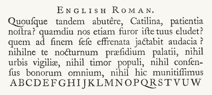
- Serif: typefaces with small strokes or "serifs" at the ends of letters; historically used in books. See serif.
- Sans-serif: letterforms without serifs, common in user interfaces and headings.
- Slab serif, script, display and monospace: specialized groups for particular visual effects or functions.
- Symbol and technical fonts: include characters for maps, scientific notation or specialized fields such as cartography, mathematics and even astrological symbols.
History and development
Typefaces evolved from handwritten letterforms and early metal movable type in Europe and Asia. Designers such as those who inspired Garamond in the 16th century established model forms that have been revived and adapted many times. A notable modern example, Times New Roman, was commissioned by a British newspaper in the early 20th century and later adapted for book and digital use; historical context is discussed in sources about The Times and type commissioning. Multiple foundries produce different interpretations under shared names: for instance, various companies offer their own versions of the Garamond style, and the relationship between versions raises questions about ownership and reuse — see materials on copyright.
Uses and significance
Typefaces shape how written information is perceived. Book designers, brand teams, web developers and wayfinding specialists choose typefaces to convey tone, improve comprehension and meet technical constraints. On screens, hinting, variable fonts and web-safe choices influence performance and rendering. Specialized typefaces serve mapping, scientific publishing and coding contexts where clarity of distinct glyphs matters; specialized examples can be found in repositories about fonts.
Notable distinctions and practical notes
Key distinctions to remember: a typeface is the overall design; a font is a specific instantiation (weight/size/style). Type design combines artistic decisions with technical work—drawing glyph outlines, setting metrics, adding kerning pairs and producing OpenType features that enable ligatures and alternates. Revivals and reinterpretations are common: designers revisit historical models to create new digital families, and licensing varies between commercial foundries and open-source projects.
Further reading and resources: introductions to typography and font technology can be found via general typography guides and dedicated font development sites: Typography overview, Fonts and files, Glyph anatomy, Legibility studies, Copyright and licensing, Cartographic type, Specialized symbol sets, Mathematical typesetting, Serif classifications, Historical commissions.
Questions and answers
Q: What is a typeface?
A: A typeface is a family of fonts that share certain design features.
Q: What are the different versions of typefaces?
A: There are many versions of typefaces which are out of copyright, such as "ITC Garamond", "Adobe Garamond" or "Monotype Garamond". These are all versions of the same typeface, originally created in the 16th century.
Q: Why do we have different fonts?
A: Different fonts give designers and printers choices to suit various needs, such as legibility and readability.
Q: What is type design?
A: Type design is the art and craft of designing typefaces. In digital typography, those who create these designs are sometimes called font developers or font designers.
Q: What does each glyph represent in a typeface?
A: Each glyph in a typeface represents an individual letter, number, punctuation mark, or other symbol.
Q: Are there any special types of faces for specific applications?
A: Yes, there are some types of faces tailored for special applications like map-making or astrology and mathematics.
Q: Can you provide an example of a widely used typeface?
A: An example of a widely used typeface is Times New Roman which was commissioned by The Times newspaper in 1931 and later adapted for use in book printing and computer use with many different versions now available.
Related articles
Author
AlegsaOnline.com Typeface (typography): definition, structure, history, and uses Leandro Alegsa
URL: https://en.alegsaonline.com/art/102356
Sources
- eyemagazine.com : Morison, Stanley. Printing the Times. Eye