
Serif (Typography): definition, history, forms, and uses
A serif is a small stroke attached to the end of a letterform. This article explains what serifs are, their anatomy and classifications, origins, practical uses, and how they differ from sans-serif designs.
A serif is a small line or stroke added to the end of a larger stroke in a letter or symbol within a typeface. In simple terms, serifs are the tiny flourishes you see on the tips of many printed letters; typefaces that include them are called serif typefaces, while those without them are referred to as sans-serif. The presence or absence of serifs is one of the most visible and important choices in type design and typography. For a general introduction to the wider field, see typography.
Image gallery
10 Images


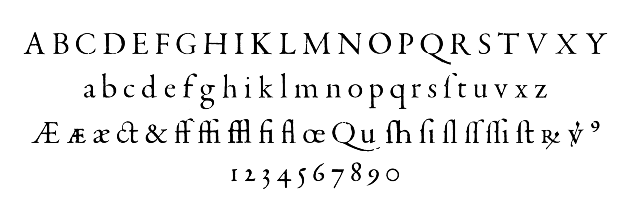


Anatomy and variants
Serifs come in a variety of shapes and join styles. Common descriptive elements include the serif's form (e.g., bracketed, slab, wedge), its thickness relative to strokes, and whether the serif is abrupt or tapered. Type designers also talk about related parts of letterforms: the stem (main vertical stroke), terminal (end of a stroke that does not have a serif), spine, and the bracket where a serif joins a stem.
- Bracketed serifs: have a smooth, curved connection between serif and stem, often seen in text faces.
- Unbracketed or slab serifs: have a square or abrupt join, commonly used for display or headline faces.
- Wedge and hairline serifs: vary in weight and taper; hairline serifs are very thin, while wedge serifs are triangular.
History and origins
The visual origin of serifs is often traced to stone carving and inscriptional letterforms. The capital letters on the Roman monument known as Trajan's Column are frequently cited as an early model for the proportions and finishing strokes that later evolved into serifs. Centuries later, the advent of movable type in Europe in the 15th century led printers and punchcutters to adapt handwritten and carved letter models for metal type; these early printers cast letters in lead and other alloys as movable type.
Classifications and notable styles
Serif typefaces are commonly grouped into broad categories based on historical development and visual traits. Typical classifications include Old Style (humanist), Transitional, Modern (Didone), and Slab Serif. Each category reflects differences in stroke contrast, axis of stress, and the form of serifs themselves. Designers choose among these styles depending on whether the goal is readability, formal appearance, or dramatic display.
Uses, readability, and distinctions
Serif faces have long been favored for extended printed text—books, newspapers, and academic material—because the shapes and small terminals can guide the eye along lines of type. In digital contexts, legibility depends on factors such as screen resolution, rendering technology, and type size; sans-serif faces are often used for on-screen interfaces, but well-hinted serif faces remain common in e-books and high-resolution displays. Beyond legibility, serif choices convey tone: traditional, formal, or scholarly associations often come with serif faces, while contemporary, clean, or technical tone is frequently expressed with sans-serif.
Notable facts and terminology
The English word "serif" emerged relatively late compared with the long history of the form itself. Historically, many printers and scholars described serifed faces as "Roman" because of their association with inscriptional and classical models. Today, designers also distinguish between text serifs (optimized for small sizes and continuous reading) and display serifs (designed for headlines, large sizes, and decorative effect). Understanding serifs helps both readers and designers make informed choices about tone, readability, and the technical requirements of different media.
Questions and answers
Q: What is a serif?
A: A serif is a tiny decorative line on the ends of letter's 'limbs' in typography.
Q: What is the difference between serif and sans-serif?
A: Alphabetic typefaces either have serifs or not. Those without are called sans-serif faces.
Q: When did the design of typefaces start?
A: The design of our typefaces started in the 15th century, when the early printers used moulds from which letters made of lead were produced.
Q: What were the original sources of the serif?
A: The original source of the serif may be in monumental inscriptions such as the letters at the base of Trajan's column built in 107~113 AD.
Q: What is the term used to describe typefaces with serifs in older literature?
A: The term used to describe typefaces with serifs in older literature is "Roman."
Q: What other issues do type designers deal with besides the serif/sans-serif feature?
A: Type designers have to deal with a large number of issues besides the serif/sans-serif feature which include the size, spacing, and shape of the letters.
Q: When was the word "serif" first used?
A: The word "serif" seems to be an early 19th century innovation.
Related articles
Author
AlegsaOnline.com Serif (Typography): definition, history, forms, and uses Leandro Alegsa
URL: https://en.alegsaonline.com/art/89066