Thematic map: maps that display spatial themes and patterns
A thematic map emphasizes the geographic distribution of a single topic—such as population, climate, or economic activity—using techniques like choropleth, dot, cartogram, and flow maps.
Overview
A thematic map is a cartographic product created to reveal the spatial distribution or pattern of a particular topic rather than to provide general geographic detail. Unlike general-reference maps that show roads, political boundaries and relief for navigation, thematic maps are built around one subject or theme: examples include maps of population density, land cover, rainfall, disease incidence and trade flows. Thematic maps translate data into visual form so patterns, trends and anomalies can be seen at a glance.
Image gallery
10 Images


Types and common elements
Thematic mapping uses a range of techniques to represent quantitative and qualitative phenomena. Common types include:
- Choropleth maps: areas are shaded or colored according to data class (e.g., population per square kilometer).
- Dot-density maps: points represent a fixed quantity to show distribution and clustering.
- Proportional symbol maps: symbols scaled in size indicate magnitude at point locations.
- Isarithmic (contour) maps: lines connect equal values, useful for continuous fields like elevation or temperature.
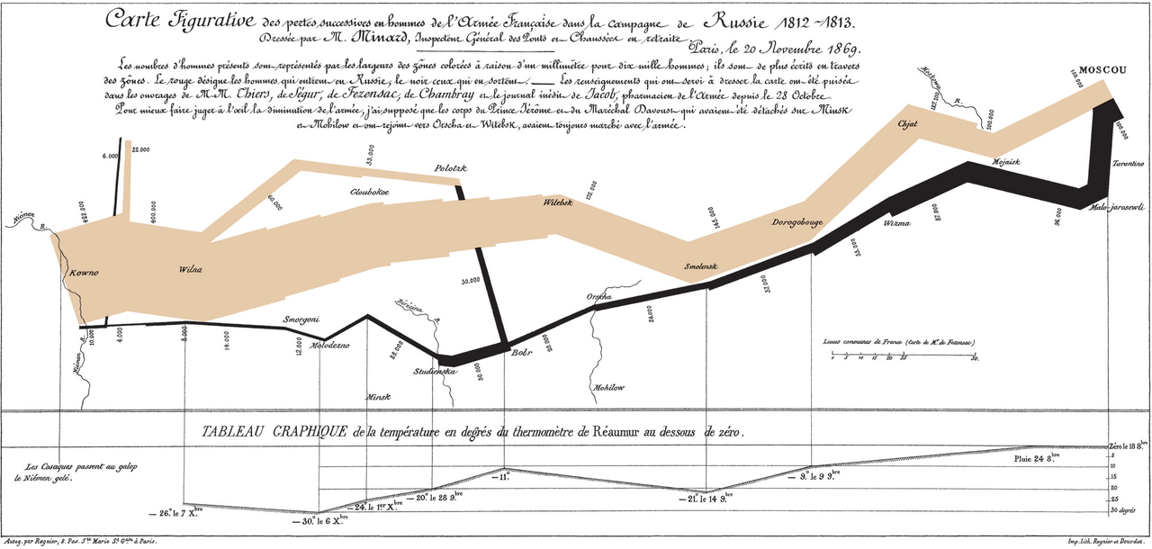
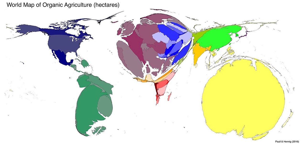
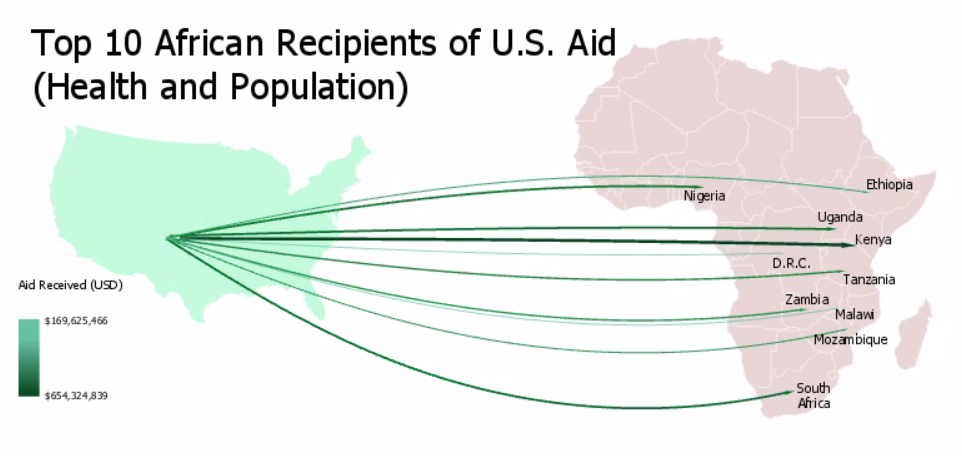
- Flow maps and cartograms: illustrate movement or distort geography to reflect a variable such as trade volume.
Every thematic map typically includes a legend, a clear title indicating the theme, a scale or indication of scale, source and date of the data, and an appropriate map projection chosen to reduce distortion for the study area.
History and development
The practice of thematic mapping developed as statistical thinking and printed charts advanced. Early examples in the 18th and 19th centuries applied shading and symbols to show phenomena such as winds, mortality, or trade. Classic case studies, often cited in cartography texts, demonstrate how a single-subject map can influence understanding of events or patterns. In the late 20th and early 21st centuries, geographic information systems (GIS) and digital data have greatly expanded the range, precision and ease of producing thematic maps.
Uses and examples
Thematic maps are tools for analysis and communication across many fields. Urban planners use them to display land use and infrastructure needs; public-health officials map disease incidence to guide interventions; environmental scientists map habitat, pollution or climate variables; economists and marketers visualize regional sales or unemployment patterns. A simple example of a thematic map is one showing population density by region, which highlights where people cluster and where services may be needed.
Design choices, pitfalls and best practices
Design decisions—choice of classification method (equal intervals, quantiles, natural breaks), color ramp, symbolization and geographic units—strongly affect how a map is read. Thematic maps can mislead if classes are chosen poorly, data are outdated or underlying administrative units vary in size (the modifiable areal unit problem). Projection distortion and scale also influence interpretation. Good practice includes clear legends, notes about sources and methods, and appropriate visual hierarchy so the theme remains the focus.
Further reading and resources
For introductions to map design and types, see general cartography guides and digital mapping tutorials. Data portals and GIS communities provide examples and datasets. Practical resources and training are available online via portals such as educational cartography sites, open data hubs at national and local levels (data repositories), and applied case studies in public-health and planning (example projects).
Questions and answers
Q: What is a thematic map?
A: A thematic map is a type of map that is used to display the distribution of human or natural features or data.
Q: How is a thematic map different from a normal map?
A: A thematic map is different from a normal map in that it is specifically designed to show information related to a particular theme or aspect of geography.
Q: What kind of information can be displayed on a thematic map?
A: A thematic map can display information related to human or natural features or data, whether or not it is related to geography.
Q: Can a map displaying population be considered a thematic map?
A: Yes, a map which shows population is an example of a thematic map, as it is showing a particular theme or aspect of geography.
Q: Why are they called thematic maps?
A: Thematic maps are called so because they show features relating to a particular theme or aspect of geography.
Q: What is the purpose of a thematic map?
A: The purpose of a thematic map is to visually represent data or information related to a particular theme or aspect of geography.
Q: How can a thematic map be useful?
A: A thematic map can be useful in providing insights into the distribution, density, or patterns of human or natural features or data related to a particular theme or aspect of geography. It can be used for analysis, planning, decision-making, and communication.
Related articles
Author
AlegsaOnline.com Thematic map: maps that display spatial themes and patterns Leandro Alegsa
URL: https://en.alegsaonline.com/art/99204
Sources
- ingentaconnect.com : "From place to space: the psychological achievement of thematic mapping"
- books.google.com : 97