
Table (information)
An organized arrangement of facts or data into intersecting rows and columns, used to present, compare and analyse information across printed and digital media.
A table of information is a systematic arrangement of facts and data organised into intersecting rows and columns. As a device for displaying information, a table depends on a chosen medium — whether recorded by writing, produced in print on paper, or shown on a computer monitor. It functions as a form of visual communication and as a compact format for organising, comparing and retrieving data. The word table in this context refers to the grid-like visual structure, not to be confused with a piece of furniture.
Image gallery
10 Images
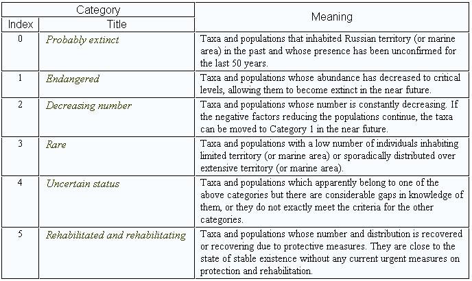


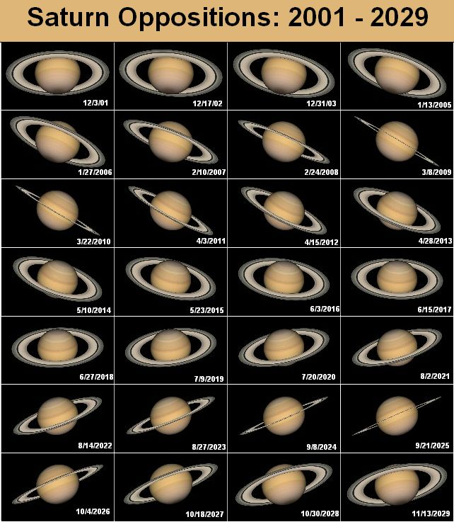
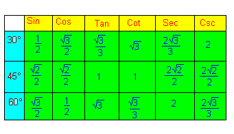


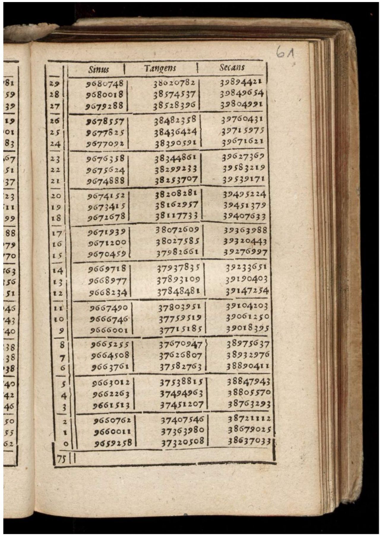

Structure and elements
At its most basic, a table consists of horizontal rows and vertical columns; the intersection of a row and a column is called a cell. Columns and rows commonly carry labels or headings that describe the content or units used in each dimension. Tables often include additional elements such as a caption, header rows, column names, footnotes and source notes to clarify what is being shown. They may also feature grouped rows or columns, merged cells and repeated headers for multi-page presentation. Because tables present discrete items in a compact matrix, careful labelling helps avoid ambiguity.
Tables frequently appear together with other graphical devices and narrative text. For explanatory or comparative purposes they may be compared with diagrams and illustrations, or supplemented by surrounding prose that interprets the numbers or categories. When it is important to emphasise trends, changes or relationships, the tabular data are commonly transformed into graphs or charts, which can be easier for many readers to scan visually. Nonetheless, tables remain essential when exact values, cross-references or many categorical combinations must be available to the reader.
History and development
Tables are among the oldest systematic devices for recording structured information. Many early civic and legal records can be read as tabular lists: for example, registers and marriage entries typically recorded individual attributes in an ordered form. Formal population counts such as the census were historically published as printed tables before the more modern graphical representations came into use, and parliamentary and administrative reports frequently relied on tabulated returns to summarise population, finance, trade and other public statistics. The development of statistical methods and the growth of government record keeping expanded the use of tables as authoritative ways to present official information.
Applications and disciplines
Tables are ubiquitous across many fields. In academic research they present experimental results, sample descriptions and regression summaries; in business they appear in reports, invoices and dashboards; in technical documentation they list specifications, tolerances and lookup values. Public-facing information — for example a weather record, timetable or legal notice — is often issued in tabular form to allow quick referencing. Legislative and administrative documents such as returns to Parliament have long relied on tables to condense extensive records into readable summaries that can be checked and cited.
Readability, variants and best practice
Although tables are highly flexible, dense tabular displays can be difficult to read. Design principles that improve comprehension include: clear and concise headings, consistent units and numeric formatting, logical ordering of rows and columns, grouping and subtotals where appropriate, the sparing use of rules and borders, and explanatory footnotes. Common variants of tables include pivot tables that summarise data by aggregating values across multiple dimensions, frequency tables that enumerate occurrences, cross-tabulations that show relationships between two categorical variables, and lookup tables used in computing to map keys to values.
- Common elements: headings, cells, row and column labels, units and footnotes.
- Variants and tools: pivot tables, summary tables, frequency distributions, cross-tabs, lookup tables and relational database tables.
- Good practice: label units, avoid misleading precision, sort for relevance and include source notes.
Modern software — spreadsheets, statistical packages and database systems — automates many aspects of table creation, layout and calculation, but the fundamental purpose remains: to present structured information so it can be compared, validated and interpreted efficiently. Tables are used in data analysis and reporting across domains from science and engineering to public administration and journalism; good tabular design supports transparency and reproducibility of findings and decisions.
Limitations and alternatives
Tables excel at precise, cell-level information and at permitting direct look-up of values, but they are less effective when the primary goal is to communicate a pattern or to highlight a trend across many observations. In such cases, transforming tabular data into visualisations such as line graphs, bar charts or heat maps can make a message clearer. Accessibility also matters: large tables require attention to reading order and assistive technology considerations so that users of screen readers or other non-visual interfaces can navigate the same information.
For further reading and tools, practitioners often consult guides and software documentation that explain how to construct, style and export tables for print and digital media. Practical examples and templates can be found in spreadsheet help files and in publishing style guides that recommend conventions for table numbering, captions and notes. Properly designed tables remain a cornerstone of clear, verifiable communication across disciplines and media, and their careful use enhances the reader's ability to draw informed conclusions from organised data.
See also: table conventions, diagram comparison, illustration use, prose integration, graphical conversions, charting methods, historical records, census tables, government returns, research tables, data analysis

Data Tables

This article or section is in need of revision: Wikipedia is not a collection of how-to and how-to guides. No knowledge is presented here, but instructions and poorly referenced opinions on design, the generality of which cannot be understood.
Please help improve it, and then remove this tag.
Construction
| Table 1: Absolute frequencies of eye and hair color combination of 592 statistics students. Source: Package datasets in R. | |||||
| Eye color | |||||
| Hair color | Brown | Blue | Grey | Green | Total |
| Brown | 119 | 84 | 54 | 29 | 286 |
| Blonde | 7 | 94 | 10 | 16 | 127 |
| Black | 68 | 20 | 15 | 5 | 108 |
| Red | 26 | 17 | 14 | 14 | 71 |
| Total | 220 | 215 | 93 | 64 | 592 |
| Table 2: Conditional frequencies of eye colors given a hair color. | |||||
| Eye color | |||||
| Hair color | Brown | Blue | Grey | Green | Total |
| Brown | 42 % | 29 % | 19 % | 10 % | 100 % |
| Blonde | 5 % | 74 % | 8 % | 13 % | 100 % |
| Black | 63 % | 18 % | 14 % | 5 % | 100 % |
| Red | 36 % | 24 % | 20 % | 20 % | 100 % |
| Total | 37 % | 36 % | 16 % | 11 % | 100 % |
The aim of tables is to provide an overview of detailed information in a short and concise form. In order to be able to extract the relevant information from tables, an appropriate structure or design is necessary. Therefore, some rules for better readability should be observed:
- Tables should contain explanatory text in an over- or caption.
This is because readers may only read the table, and then the most important information should be included in the
heading or caption. Also, in an automatic (dynamic) layout, a table is moved to the next page after the descriptive text for space reasons, and even then, additional information is important. - Table headings or the legend should contain a separate identifier, for example a numbering, for documents with several tables.
- Then you can clearly refer to a specific table in the accompanying text.
- A table should also be described in the accompanying text.
A table is often not easy to read, so the important statements in the table should be pointed out in the accompanying text. Otherwise, readers who are not familiar with the subject matter might not grasp the meaning of the table. - A table should not contain too many columns and rows.
The psychologist George A. Miller proved in 1956 that one can
only remember "information" in
short-term memory. Therefore, a guide to the number of columns and rows is
each. - Rows and columns should be in natural order or ordered by size.
In Table 1, the rows and columns are ordered by row or column totals. Alternatively, alphabetical sorting by hair or eye color name would have been possible here. The order in Table 2 follows Table 1, since the reader is already familiar with the order in Table 1. - You should not use repeat characters, such as "ditto".
It is better to leave the place empty or simply repeat the number. - Tables should not contain unrelated information.
It is then better to split the information into two or more tables. For example, Table 1 and Table 2 could have been combined into one table, but the information is better presented in two tables. - The layout should "guide" the eye:
- Avoid vertical lines
- Avoid double lines
- To support the readability it is better to use background colors instead of a line "network".
- A good example can be found in the documentation for the LaTeX package booktabs on page 2.
- Units of measurement should be written in the header of each column.
If you omit the units of measurement, it is unclear in which unit of measurement the data is given. If you write them at the bottom of the table, you have to search for them first. - Totals (or averages) should be given for columns and rows if possible/necessary.
This saves a reader from having to calculate the totals and also allows them to check the table values. - Values that are to be compared had better be in different columns and not in different rows.
From each column in Table 2, a statistician can immediately infer that there is a relationship between hair and eye color because of the different values. - Text should be set flush left.
Readers whose native language is German are used to text being written from left to right and can therefore grasp left-justified text more quickly. In languages where the writing direction is different, e.g. Hebrew or Arabic, right-justified texts will be preferred. - For numbers:
- Large numbers should be placed at the top if possible
- They should be set right-justified
- They should be rounded to two or three significant digits
- They should contain leading zeros, i.e. "0,1" instead of ",1".
- The decimal points for numbers in a column should always be placed below each other.
- Table 2 gives an example of this. However, rounding the entries to whole percentages using commercial rounding leads to the problem that the row total no longer adds up to 100%, but to 99% or 101%. Therefore, sum-preserving rounding has been used here.
The rules are intended to help improve the understanding and readability of tables and do not apply absolutely. Table 1 shows the eye and hair color data set with the absolute frequencies of statistics students with the aim of showing a dependency between eye and hair color. The rules have been followed as much as possible, e.g. the background color changes from row to row to make it easier to read the values in a row, or the eye and hair colors have been sorted by the size of the column or row totals. However, since the table standard in Wikipedia is to use a grid of lines, this has been retained, unlike the rules. From Table 2, one can see that there is a correlation between hair color and eye color.
Visualization
With a heat map
→ Main article: Heatmap
There are various ways of graphically displaying tables with numerical values. One possibility is to replace the numerical entries with symbols or colors.
In the figure, the frequencies in Table 1 have been replaced by rectangles with corresponding shades of gray. The darker a rectangle appears, the more often the corresponding combination of characteristics occurred among the 592 statistics students. The combination brown eyes and hair thus occurred most frequently, the combinations green eyes and black hair or brown eyes and blond hair most rarely.
With a mosaic plot
→ Main article: Mosaic plot
Since Table 1 and 2 represent absolute and conditional frequencies, respectively, they can also be presented in a so-called mosaic plot. The height of each rectangle is determined by the relative proportion of the corresponding hair colour. Thus, for the hair color brown, the result is  , i.e., the rectangles in the 1st row have a height of approximately 48 % of the total height of the graph. The width of the rectangles is obtained from the conditional frequencies in Table 2, so the rectangle for brown hair and brown eyes has a width of 42% of the total width of the graph. The proportion of the area for one combination of characteristics to the total area corresponds exactly to the proportion of this combination of characteristics. Thus, the area for the brown rectangle is
  , or about one-fifth of the total area.


See also
- List - one-dimensional table
- Matrix - arrangement of numerical values or other objects in tabular form in linear algebra.
- Table digits - special digits with the same width (thickness) so that the digits are flush with each other.
Questions and answers
Q: What is a table of information?
A: A table of information is a set of facts arranged in rows and columns. It is a way of displaying information, typically using writing or print on paper, or a computer monitor.
Q: How are tables usually labeled?
A: Tables usually have names or labels for the columns and rows. They may also include notes, headers, footers or other features.
Q: When were tables first used to display data?
A: Tables were the first way to print social and scientific data before any other kind of graphics like graphs and charts. All the information about a modern society was recorded and published first as tables.
Q: Where can tables be found?
A: Tables can be found in print media, handwritten notes, computer software, architectural ornamentation, traffic signs and many other places. The details vary according to circumstances.
Q: What are some advantages of using tables?
A: Tables are extremely flexible and can easily be constructed on computer and in print. They are also useful for presenting large amounts of data in an organized manner that makes it easier to understand than if presented as prose alone.
Q: Is it easy to interpret data from tables? A: Not always - there is an entire industry devoted to taking table information and turning it into other forms such as graphs or charts which may make it easier for readers to understand the data being presented.
Related articles
Author
AlegsaOnline.com Table (information) Leandro Alegsa
URL: https://en.alegsaonline.com/art/95797