Pie chart: definition, uses, and interpretation
A pie chart is a circular graphic that shows parts of a whole. This article explains how pie charts work, their history, common uses, strengths and limitations, and best practices for clear presentation.
Overview
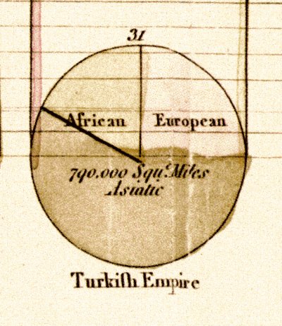
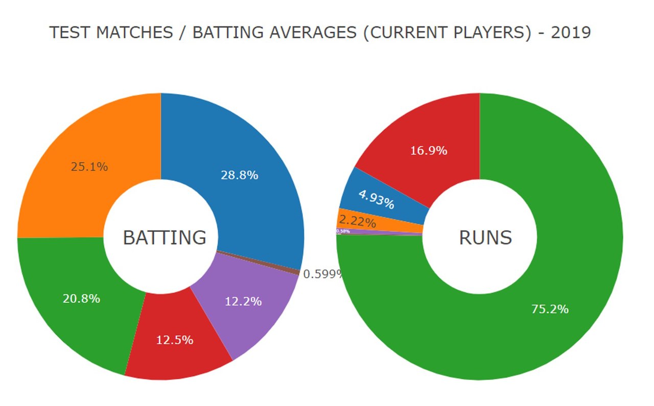
A pie chart is a circular graphic that divides a whole into slices, where each slice represents a category's proportion of the total. The area or angle of each slice is proportional to the value it represents. Pie charts are intended to communicate relative sizes quickly, allowing readers to see which categories are largest or smallest at a glance.
Image gallery
9 Images


Characteristics and components
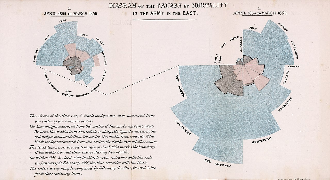
Typical elements include slices (segments), labels or legends, percentage or value annotations, and color coding to distinguish categories. The angle at the center of each slice corresponds to the share of the total; labels may be placed inside slices or beside them. Variants include the exploded pie (one slice pulled away) and the donut chart (a pie with a central hole).
History and development
Pie charts have been used for more than two centuries and are commonly attributed to early statistical graphic pioneers of the modern era. Over time they became a staple in business reports, journalism, and education for showing part-to-whole relationships. Modern software tools make generating pie charts simple, but their visual design and interpretation remain governed by basic principles of proportion and labeling.
Common uses and examples
Pie charts are frequently used to display market share, survey results, budget allocations, or any dataset where the total is meaningful and categories represent parts of that whole. They work best when there are a small number of categories (typically fewer than six) and when one or a few categories dominate. For examples and templates, see a general overview here.
Strengths, limitations, and alternatives
- Strengths: Intuitive for audiences, emphasizes relative proportions, compact presentation.
- Limitations: Difficult to compare similar-sized slices, problematic with many categories, and easily misleading when distorted by 3D effects or unequal radii.
- Alternatives: Bar charts, stacked bars, treemaps, and dot charts often convey comparisons more precisely; guidance on when to choose alternatives is available here.
Best practices and notable facts
To improve clarity, order slices by size (largest to smallest), display percentage labels, limit the number of slices, use contrasting colors, and avoid extraneous 3D styling. When the numeric comparisons among categories matter more than part-to-whole context, prefer a bar chart. For discussion of conventions and typical misuses, consult practical style guides here and here.
Note: Donut and sunburst charts are related forms that can add hierarchical or space for central labeling but share the same interpretive constraints as standard pie charts.
Questions and answers
Q: What is a pie chart?
A: A pie chart is a type of chart that has the shape of a pie or circle.
Q: What is the purpose of a pie chart?
A: The purpose of a pie chart is to present the relationship of different parts of the data.
Q: How can one easily identify the biggest or smallest share of the data?
A: One can easily identify the biggest or smallest share of the data by simply looking at the pie chart.
Q: What makes a pie chart unique?
A: What makes a pie chart unique is its circular shape that represents the whole data and its parts.
Q: Can a pie chart be used to compare data?
A: Yes, a pie chart can be used to compare data.
Q: What are the advantages of using a pie chart?
A: The advantages of using a pie chart are that it is visually appealing, easy to understand, and it quickly identifies the biggest or smallest share of the data.
Q: What types of data are best represented using a pie chart?
A: Data that can be broken down into parts or percentages are best represented using a pie chart.
Related articles
Author
AlegsaOnline.com Pie chart: definition, uses, and interpretation Leandro Alegsa
URL: https://en.alegsaonline.com/art/76759