Olive (color)
Olive is a subdued yellow‑green hue named for the olive fruit; it appears in nature, design, military uniforms and minerals, with muted, grayish and brownish variations used as a versatile neutral.
Olive is a subdued yellow‑green hue that occupies a place between green and yellow on the spectrum. The color is typically muted and earthy rather than bright, and many of its tones are produced by reducing saturation or shifting the balance toward gray or brown. In subtractive mixing, adding a neutral such as gray will desaturate yellow or green toward olive, while darkening with black or blending with brown yields deeper, brownish olive shades.
Image gallery
8 Images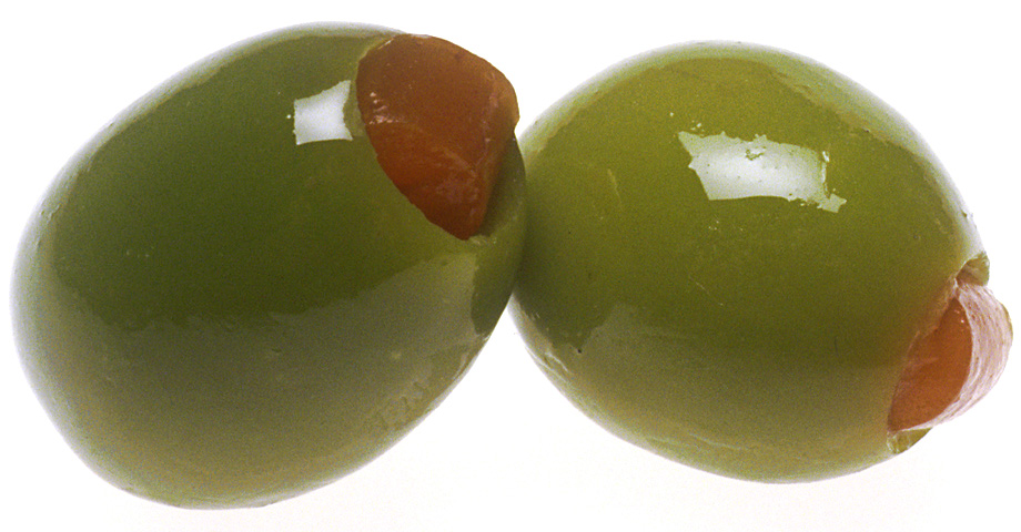


Characteristics
Olive ranges from pale, slightly yellowish greens to deep, almost brownish greens. It is commonly described as warm and natural, owing to its associations with foliage and the olive tree. Visually, olive reads as less vivid than pure greens like grass or lime and often functions as a neutral in palettes. Designers and manufacturers frequently treat olive as a flexible background or accent color that pairs well with creams, warm woods, ochres and muted metallics.
Name and origin
The name derives from the olive fruit; the outer skin of many olives shows the characteristic yellow‑green to green shade found in the color name. The fruit itself, and regional varieties of the tree, have helped the term spread in many languages, reinforced by the long cultural presence of the olive in Mediterranean landscapes. Processed or ripe olives can show interior tones that range to orange or red, but the color term usually refers to the exterior, subdued green.
Uses and examples
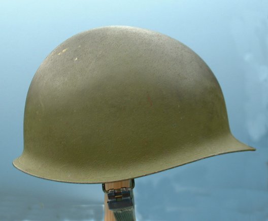
- Military: muted olive tones such as "olive drab" are widely used for camouflage, uniforms and equipment because they reduce visibility in many natural settings.
- Fashion and interiors: olive is popular for outerwear, trousers, upholstery and painted walls; it reads as a neutral that adds warmth and depth without dominating a room.
- Graphic and product design: olive conveys natural, organic or vintage aesthetics and appears as a named color in many palette systems and web lists.
Variations and related notes
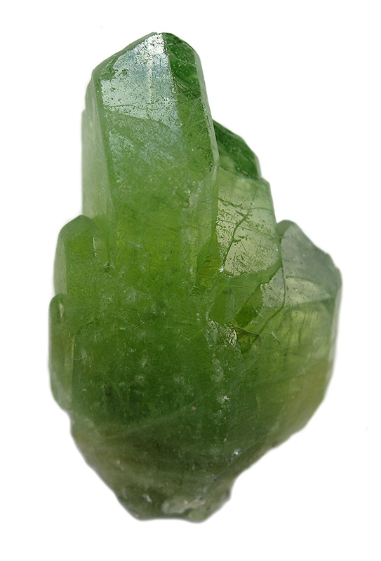
Common variant names include olive green, olive drab and gray‑olive; darker mixes produce dark olive, while lighter washes yield khaki‑adjacent tones. The mineral olivine is named for its pale olive‑green crystals and is a geological reference for the hue; see an associated reference for the mineral. Olive sits among other earth tones such as moss, sage and khaki, which share muted green characteristics but differ in warmth and brightness.
Mixing and pairing tips
To obtain a typical olive, start with a mid green and reduce saturation with a small amount of gray or add a touch of yellow and brown for warmth. Olive works well with neutral palettes, complements deep blues and burgundies, and balances brighter accents like terracotta or mustard. Because of its subdued character, olive is often chosen where a design needs color that is organic and restrained rather than vivid or highly saturated.
For botanical context, the fruit that gives the color its name and the stone‑colored mineral mentioned above illustrate how olive functions across natural and human‑made systems. For further reading on the fruit itself, see the general entry on the olive and resources about color naming and palette standards.
Questions and answers
Q: What color is olive?
A: Olive is a color which looks like green or yellow.
Q: How do you get different shades of olive?
A: Different shades of olive can be produced by adding gray or black to yellow, or by mixing a darker color (like brown) with green.
Q: Where is the most common place to find the color olive?
A: The most common place to find the color olive is on an olive. It is the color of the outside of an olive.
Q: What color is usually found in the center of an olive?
A: The center of an olive is usually brown, but sometimes it can be orange or red.
Q: Is there something else that has a pale olive colored hue?
A: Yes, there is a mineral called olivine that has a pale olive colored hue.
Q: Is olivine related to olives in any way?
A: No, olivine and olives are not related in any way - they just share similar colors.
Related articles
Author
AlegsaOnline.com Olive (color) Leandro Alegsa
URL: https://en.alegsaonline.com/art/72385