Ligature (writing and typography)
A ligature is a single glyph formed from two or more characters. This article explains what ligatures are, their history, typographic function, common examples, and how modern fonts handle them.
Overview
In writing and typography, a ligature is a glyph that represents a combination of two or more characters joined together as one unit. Rather than displaying separate letter shapes side by side, a ligature replaces the sequence with a single designed mark to improve the appearance or to reflect a historical or orthographic convention.
Image gallery
10 Images


How ligatures work
Technically, a ligature results when two or more graphemes are rendered as a single glyph. In digital typography, the font contains an alternate glyph and substitution rules so that when a particular letter sequence is encountered the font swaps in the ligature. These substitutions can be automatic or optional, and modern font formats often expose features that let users enable or disable different classes of ligatures.
Origins and historical examples
The practice comes from handwriting and manuscript traditions in which adjacent letters were merged to speed writing and save space. A widely cited historical example is the ampersand: the symbol & began as a ligature of the Latin letters Latin "et" (meaning "and"). Over time that joined form evolved into a distinct character, the ampersand, still used today as a convenient shorthand.
Common ligatures and uses
Designers create ligatures for both functional and aesthetic reasons. Typical Latin-script ligatures include combinations such as "fi", "fl", and longer forms like "ffi" and "ffl"; older or language-specific ligatures include "æ" and "œ". Some ligatures have become encoded as single characters in computing standards, while others remain handled by font substitution. Ligatures are important in body text, logos, and display typography to avoid awkward collisions and to create smoother word shapes.
Types and distinctions
- Standard ligatures: common combinations that most fonts substitute by default to improve spacing and legibility.
- Discretionary ligatures: more decorative joins used for display typography and branding.
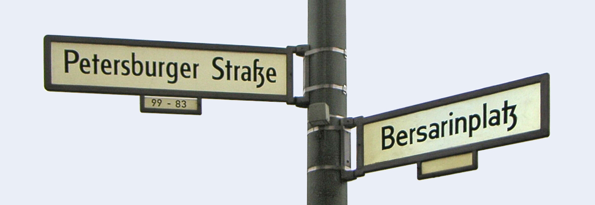
- Historical/Orthographic ligatures: forms that reflect older spelling or specific language conventions (for example, the origin of the German ß as a historical ligature of long s and z).
It is also important to distinguish typographic ligatures from the contextual shaping of cursive scripts such as Arabic, where letter forms change depending on position; those are related phenomena but arise from script rules rather than designer substitution alone.
Practical considerations
Modern digital fonts and layout systems support ligature features, often controlled via OpenType settings. Designers may enable standard ligatures for improved readability while disabling discretionary ligatures in technical contexts where precise character shapes matter (code listings, serial numbers, or tabular data). For further reading on typographic practice and terminology, see resources on both historical manuscript practice and contemporary font technology (glyph references and implementation guides are useful starting points).
For illustrative historical examples and technical notes about character encoding, see dedicated discussions of the ampersand and encoded ligatures in character sets (ampersand example), and overviews of grapheme-to-glyph mapping in type design (grapheme, typography). Additional practical tips for when to use or avoid ligatures are available in typographic manuals and font documentation (writing, Latin script notes).
Questions and answers
Q: What is a ligature?
A: A ligature is when two or more letters are joined together as a single glyph.
Q: Where does the idea of ligature come from?
A: The idea of ligature comes from handwriting and manuscripts.
Q: What is an example of a ligature?
A: An example of a ligature is the ampersand symbol "&", which represents the Latin conjunction "et" meaning "and".
Q: Why are ligatures sometimes made?
A: Ligatures are sometimes made to make things easier to read or to make the writing/font nicer to look at.
Q: Who creates ligatures for typefaces?
A: Type designers, who create fonts (or 'typefaces'), make ligatures for some combinations of letters.
Q: How are ligatures made in digital typefaces?
A: In digital typefaces, ligatures are programmed to appear when two letters are put next to each other, as a separate symbol that has been drawn by the creator.
Q: Do most fonts today exist in digital form?
A: Yes, most fonts are made on computers and exist in digital form, and these are called 'digital typefaces'.
Related articles
Author
AlegsaOnline.com Ligature (writing and typography) Leandro Alegsa
URL: https://en.alegsaonline.com/art/57922
Sources
- merriam-webster.com : "The Ampersand & More"