
Aquamarine (color)
Aquamarine is a pale blue-green tint named after the gemstone; commonly used in design and healthcare for its cool, calming appearance and close relation to blue and green hues.
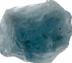
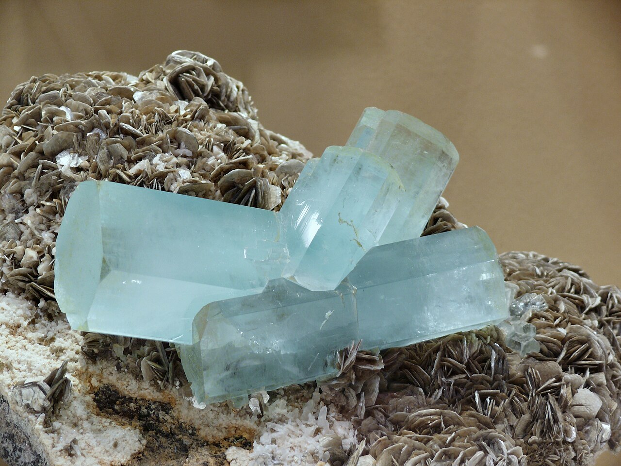
Aquamarine is a pale, cool color located between blue and green on the visible spectrum and is named after the transparent gemstone aquamarine gemstone. As a descriptive term it denotes a light tint that evokes the color of shallow sea water or certain gemstones, and is often described as a soft, slightly greenish blue.
Image gallery
6 Images


Characteristics
Aquamarine is typically perceived as a light, low‑saturation hue. It is used in pigments and digital media as a pastel or minty blue‑green. Depending on medium and illumination it can lean more toward blue or toward green. Designers treat aquamarine as a cool, soothing color that pairs well with neutral tones and other pastels.
History and name
The color takes its name from the mineral of the same name, which provided a familiar reference point in European languages. The first recorded use of "aquamarine" as a color name in English is noted from 1598, reflecting long-standing cultural associations between the stone, seawater, and a pale bluish‑green tint.
Uses and cultural associations
Aquamarine appears in several practical and symbolic contexts. It is widely used in fashion, interior design, and branding where a calm, fresh impression is desired. In healthcare settings the color is commonly applied to uniforms and decor because many find it relaxing; examples include clothing for nurses and surgeons and painted walls in hospitals, where subdued blues and greens are chosen to reduce stress and fatigue.
Variations and distinctions
- Often confused with turquoise and teal, aquamarine is lighter and less saturated than both.
- Compared with cyan, aquamarine is typically greener and softer in appearance.
- In print and pigment form it may differ from screen representations because inks and light mix colors differently.
Notable facts include its frequent use as a pastel accent in modern palettes and its symbolic ties to water, tranquility, and clarity. When selecting a specific aquamarine tone for a project, designers check samples across materials because the perceived color can shift with lighting, finish, and surrounding colors.
Questions and answers
Q: What is Aquamarine?
A: Aquamarine is a color, a light tint between blue and green.
Q: Where does Aquamarine get its name from?
A: Aquamarine gets its name from the gemstone aquamarine.
Q: When was the first recorded use of Aquamarine as a color name in English?
A: The first recorded use of Aquamarine as a color name in English was in 1598.
Q: What is medium Aquamarine used for?
A: Medium Aquamarine is used for the uniforms of nurses and surgeons and also used to paint rooms in hospitals.
Q: Why is medium Aquamarine used in hospitals?
A: Medium Aquamarine is used in hospitals because it is regarded as a color that calms and relaxes the patients.
Q: Is Aquamarine a mix of blue and green?
A: Yes, Aquamarine is a light tint between blue and green.
Q: What gemstone gives Aquamarine its name?
A: The gemstone aquamarine gives Aquamarine its name.
Related articles
Author
AlegsaOnline.com Aquamarine (color) Leandro Alegsa
URL: https://en.alegsaonline.com/art/5086