Hertzsprung–Russell diagram (H-R diagram)
A scatter plot that relates stellar luminosity and effective temperature. The H‑R diagram reveals the main sequence, giants, supergiants and white dwarfs and is central to stellar evolution studies.
Overview
The Hertzsprung–Russell diagram is a fundamental graphical tool in astronomy that arranges stars according to their intrinsic brightness and surface temperature. Rather than showing where stars are located on the sky, an H‑R diagram places each star on a two‑dimensional plot so that physical patterns and evolutionary relationships become visible. The plot is often called an H‑R diagram or HRD and is widely used to compare populations of stars, illustrate life stages, and test theoretical models of stellar structure.
Image gallery
7 Images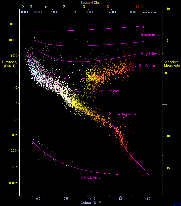


Axes and measurable quantities
There are two common ways to build an H‑R diagram. A theoretical version plots stellar luminosity against effective temperature (measured in kelvin), while an observational version uses absolute magnitude or colour indices against spectral class or colour. On most diagrams the temperature axis runs from hot on the left to cool on the right, which is the reverse of many familiar plots. Spectral types (O, B, A, F, G, K, M) and colour indices are frequently used as horizontal labels to help relate the diagram to observable spectra.
Structure and main regions
When many stars are plotted together, distinct groupings appear. The best known is the main sequence, a continuous band where stars spend the majority of their lifetimes fusing hydrogen in their cores. Above the main sequence lie the giants and supergiants, stars that have expanded and cooled after exhausting central hydrogen. Below and to the left are the compact, faint white dwarfs, remnants of lower‑mass stars that no longer sustain fusion.
- Main sequence: mass largely determines a star's position; more massive stars are hotter and more luminous.
- Giants and supergiants: higher luminosity, larger radii, cooler surface temperatures.
- White dwarfs: low luminosity, high temperature but small radius; final evolutionary stage for many stars.
History and naming
The diagram is named for the two astronomers who developed it independently in the early 20th century, Ejnar Hertzsprung and Henry Norris Russell. Their work established that stars of different spectral types occupy characteristic places on the plot and suggested links between spectroscopic properties and intrinsic luminosity. Over time the H‑R diagram became a cornerstone for interpreting stellar observations and for connecting theory with data.
Uses and scientific importance
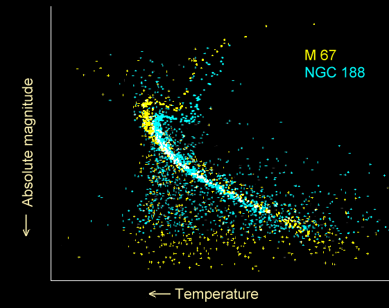
The H‑R diagram is essential across many areas of stellar astronomy. Astronomers use it to estimate the ages of star clusters by fitting model isochrones, to infer stellar masses and radii, and to test theories of stellar evolution. It also helps classify variable stars, understand population differences in galaxies, and interpret surveys of nearby stars where absolute magnitudes can be measured. Applied correctly, the diagram communicates a star's evolutionary state more clearly than any single observable.
Forms, caveats and notable facts
There are variations in how an H‑R diagram is presented. An observational H‑R diagram might use apparent magnitudes and colour indices for samples at known distances, while a theoretical H‑R diagram uses model luminosity and effective temperature. Interstellar extinction, unresolved binaries, and measurement uncertainties can blur the expected sequences, so astronomers correct data before drawing conclusions. The H‑R diagram remains a simple but powerful summary of stellar physics and a standard reference in observational and theoretical work; examples and educational diagrams are widely available for students and researchers interested in stellar populations (diagram, comparison, HRD resources).
Questions and answers
Q: What is the Hertzsprung-Russell diagram?
A: The Hertzsprung-Russell diagram is a graph of many stars that shows the relation between stars' luminosity and their temperature.
Q: Are Hertzsprung-Russell diagrams pictures or maps of where the stars are located?
A: No, Hertzsprung-Russell diagrams are not pictures or maps of where the stars are. They plot each star on a graph measuring the star's brightness versus its temperature.
Q: What are Hertzsprung-Russell diagrams also called?
A: Hertzsprung-Russell diagrams are also called H-R diagrams or HRDs.
Q: How many stars were used to create the Hertzsprung-Russell diagram in the text?
A: The diagram in the text is based on measurements from 23,000 stars in our Milky Way galaxy.
Q: Who were the creators of the Hertzsprung-Russell diagram?
A: The Hertzsprung-Russell diagram is named after its creators, astronomers Ejnar Hertzsprung and Henry Norris Russell.
Q: What does the Hertzsprung-Russell diagram measure for each star?
A: The Hertzsprung-Russell diagram measures the star's brightness or luminosity versus its temperature, for each star plotted.
Q: What is the significance of the Hertzsprung-Russell diagram?
A: The Hertzsprung-Russell diagram is significant because it allows astronomers to classify stars based on their temperature and luminosity, and also provides clues about a star's age and evolutionary stage.
Related articles
Author
AlegsaOnline.com Hertzsprung–Russell diagram (H-R diagram) Leandro Alegsa
URL: https://en.alegsaonline.com/art/43910