Gray: characteristics, history, uses, and cultural meanings
Gray (or grey) is an achromatic color between black and white, used widely in design, nature, and language; it signifies neutrality, formality, and subtlety across cultures and media.
Overview
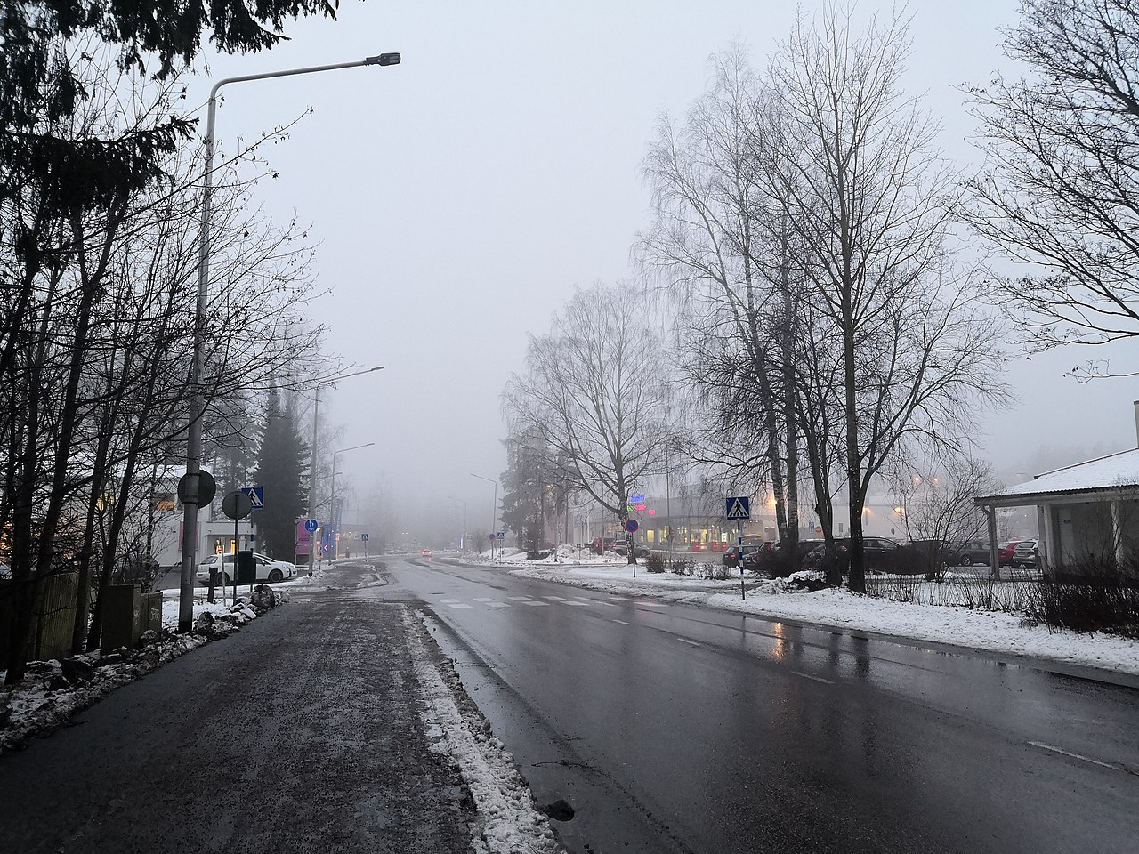
Gray is an achromatic color that sits between black and white. It appears wherever light and dark combine or where pigments are desaturated. Everyday examples include the skin of an elephant, weathered concrete like cement, the mark left by a pencil, and many cloud formations. Visually, gray often reads as a softened black or a darkened white, depending on its relative lightness.
Image gallery
10 Images


Characteristics and variants
Gray covers a broad range of tones from near-black to near-white. Descriptive names such as slate, charcoal, dove and silver identify common variants; some lean slightly toward blue, brown or green while remaining largely neutral. In practice, designers distinguish between pure neutral grays and those with a subtle hue shift, and photographers refer to gray values when talking about grayscale imagery.
History, language and spelling
The word has ancient roots: the earliest recorded use of the term in English dates to around the early medieval period. Spelling differs by region: many countries use United Kingdom-style grey, including Canada, Australia, South Africa, India, Ireland and New Zealand, while the United States commonly uses gray.
Uses and cultural meanings
Gray is widely used in architecture, product design, fashion and graphic arts for its neutrality and subtlety. It commonly conveys balance, calm, authority or formality, but can also suggest austerity or melancholy depending on context. In printing and digital media, grayscale is a practical mode for reproducing images without color, and many manufacturers list gray finishes for metals, fabrics and plastics.
Practical notes and distinctions
- Mixing: in pigment work, gray can be achieved by blending black and white or by mixing complementary colors to neutralize saturation.
- Perception: surrounding colors and light level affect whether a gray looks warm, cool or neutral.
- Terminology: "gray" and "grey" are interchangeable in meaning; usage depends on regional spelling conventions noted above.
Gray's versatility—ranging from industrial concrete to subtle fashion neutrals—makes it a fundamental element in both visual language and everyday environments.
Questions and answers
Q: What is gray or grey?
A: Gray or grey is the color of black and white mixed together.
Q: What are some examples of things that are gray?
A: Examples of things that are gray include an elephant, cement, pencil writing, and rainy clouds.
Q: How does gray look?
A: Gray often looks like someone made black lighter, but not so light that it is white.
Q: What does the color grey represent?
A: Grey represents neutrality and balance.
Q: How do different countries spell the word "gray"?
A: In the United Kingdom, Canada, Australia, South Africa, India, Ireland, and New Zealand as well as a few other countries this word is spelled "grey". In the United States it is spelled "gray".
Q: When was the first recorded use of gray as a color name in English?
A: The first recorded use of gray as a color name in English was in 700.
Related articles
Author
AlegsaOnline.com Gray: characteristics, history, uses, and cultural meanings Leandro Alegsa
URL: https://en.alegsaonline.com/art/40421