False color: techniques and applications in imaging and visualization
False color is a set of methods that map measured data to visible colors to reveal features not seen in true-color images. Widely used in remote sensing, astronomy, medical imaging and visualization.
Overview
False color describes methods that assign visible colors to data in ways that differ from how the human eye would naturally perceive a scene. Instead of reproducing the scene's apparent hues (a true‑color image), false color maps measurements — for example, wavelengths outside the visible range or numerical values such as temperature — into visible colors so that structure, contrast and patterns become easier to see.
Image gallery
10 Images


How false color is created
Several practical techniques are used to produce false‑color images. Common approaches include channel swapping (placing a nonvisible band into the red, green or blue display channels), applying color lookup tables (LUTs) to grayscale data, and compositing three or more spectral bands into a single RGB image. The result is a visual representation in which color encodes information rather than literal appearance.
- Channel composites and multispectral band mapping
- Grayscale to color mapping via LUTs (pseudocolor)
- Gradient and heat maps for scalar fields
- Custom palettes to highlight specific ranges or anomalies
History and development
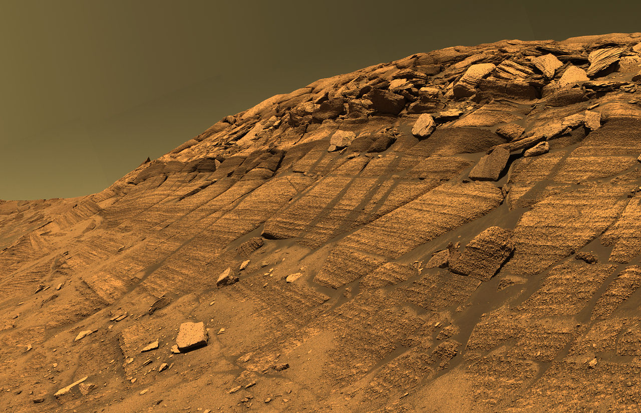
Origins of false color extend from early aerial and infrared film photography used in reconnaissance and vegetation study to later electronic multispectral imaging on satellites and spacecraft. As sensors began to capture wavelengths beyond visible light, scientists and technicians developed standardized and ad hoc color mappings to interpret these data. Modern digital processing tools and remote‑sensing systems expanded these practices to many disciplines.
Common uses and examples
False color is widely used where raw measurements are not directly visible or where contrast needs boosting. Typical applications include:
- Remote sensing: mapping vegetation, water, soil and urban areas using near‑infrared, shortwave infrared and visible bands.
- Astronomy: showing ultraviolet, X‑ray, radio or infrared observations in visible hues so structures and energetic processes stand out.
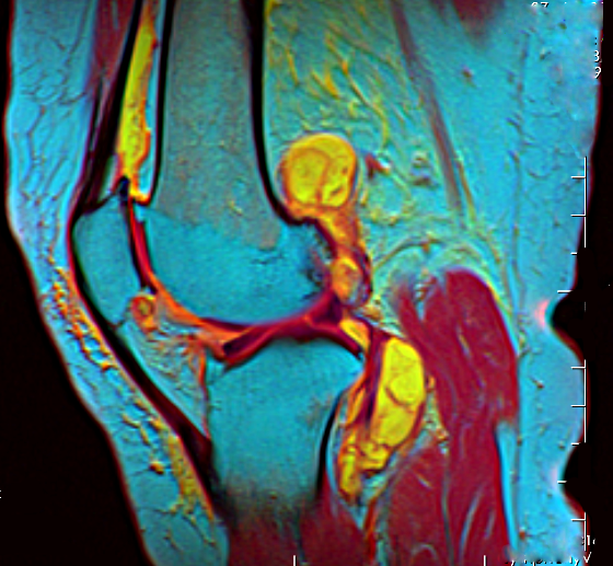
- Medical imaging and thermography: translating intensity or temperature fields into color scales for diagnosis or inspection.
- Scientific visualization: displaying scalar and vector fields, concentration maps, or model output with intuitive color ramps.
For practical examples and tutorials, see multispectral compositing techniques and resources on pseudocolor mapping.
Distinctions and best practices
False color is sometimes conflated with pseudocolor, but the terms have different emphases: pseudocolor tends to mean applying a color map to single‑band data, while false color often implies mapping physically different spectral bands into an RGB image. In both cases, careful palette design matters: color choices can imply false continuity or hide important values. Good practice uses perceptually uniform palettes, clear legends, and explicit notes about what each color encodes.
Notable considerations
Interpreting false‑color imagery requires understanding the underlying data and the mapping used. The same sensor data can convey different messages depending on band selection and color mapping. To explore datasets and case studies, consult remote sensing guides, astronomical imaging primers, and applied visualization tutorials at technical repositories.
False‑color imagery remains a fundamental tool across science and engineering: by converting measurements into visible signals, it reveals structure and trends that would otherwise be hidden from direct observation.
Questions and answers
Q: What is false color?
A: False color refers to a group of color methods used to display recorded images in color, where an image shows an object in colors different from what a true-color photograph would show.
Q: Why are false color images used?
A: False color images are used to visualize genuine data for extra information that the eye would not see, such as infrared light, which humans cannot see.
Q: What is a true-color image?
A: A true-color image is a photograph shot in color, which shows the colors in the picture as they appeared on the film or to the sensor of a digital camera, made to show the world as human color vision would see it.
Q: What does false color represent in an image?
A: In an image, false color is used to represent extra information that the eye would not see, such as infrared light, and does not correspond to the one the human eye would see.
Q: What does a false-color image show?
A: A false-color image shows an object in colors different from that which a true-color photograph would show, where color is used for extra information that the eye would not see.
Q: What are some examples of information shown in false color images?
A: Many false color images show infrared light that humans cannot see or display other invisible information, such as temperature or magnetic fields.
Q: How are true-color images different from false color images?
A: True-color images show colors as they appear to human vision, while false color images use different colors to represent extra information not visible to the naked eye.
Related articles
Author
AlegsaOnline.com False color: techniques and applications in imaging and visualization Leandro Alegsa
URL: https://en.alegsaonline.com/art/33403
Sources
- landsat.gsfc.nasa.gov : "The Landsat 7 Compositor"