
Champagne (color)
Champagne is a pale, warm tint ranging from very light yellow to soft orange-beige, named after the sparkling wine and used widely in design, fashion, and decoration.
Overview
The term "champagne" refers to a family of very pale, warm tints that sit between light yellow, soft orange, and beige. It evokes the delicate, effervescent tone of the champagne beverage from which the name is drawn. Because the shade is subtle and neutral, it is frequently used where a gentle, elegant background color is desired rather than a strong or saturated hue. Designers and manufacturers may label several slightly different tints as "champagne," so the exact appearance can vary by industry and context.
Image gallery
4 Images

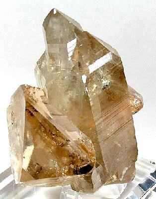

Characteristics
Champagne colors are typically described by a few common properties:
- Light value: the color is pale, allowing it to pair easily with both light and dark accents.
- Warm undertone: it carries faint yellow or orange warmth rather than cool gray.
- Neutral appearance: it reads as a subtle beige or off-white in many lights, making it useful as a background or base color.
For reference, some writers compare champagne to yellowish creams and to muted orange-tinted neutrals; others describe it as close to beige. Variants include metallic or pearlescent finishes sometimes labeled metallic champagne for products like paint or packaging.
History and name
The name derives directly from the appearance of the sparkling wine known as champagne; the association emphasizes lightness and refinement. The earliest recorded use of "champagne" as a color name in English dates to the early 20th century, reflecting the fashion and decorative tastes of that era. Over the decades the name was adopted across textiles, cosmetics, interior paint, and industrial design to suggest understated luxury.
Uses and symbolism
Champagne is popular in contexts that seek an elegant, neutral backdrop: wedding palettes, formal wear (including gowns and accessories), product packaging for premium goods, and interior finishes. It often signifies sophistication, subtlety, and celebration without the boldness of brighter colors. In cosmetics, champagne tones appear in highlighters and eye shadows to create a luminous but natural look.
Similar colors and distinctions
Champagne overlaps with colors such as ivory, cream, ecru, and light tan, but it is typically warmer than ivory and less pink than some "champagne pink" variants. When precision is required—such as in branding or manufacturing—champagne may be specified with a particular swatch, finish, or numerical color standard. For further comparisons, see resources on neutral and pastel palettes available through general color references (palette guide) and historical color naming (naming history).
Because the label covers a range of closely related tones, consumers and designers should confirm exact samples before committing to fabrics, paints, or finishes to ensure the chosen tint meets expectations.
Questions and answers
Q: What is the color Champagne?
A: Champagne is a very pale tint of yellowish-orange that is close to beige.
Q: Why is it called Champagne?
A: The color is named after the average color of the drink Champagne.
Q: When was the first time Champagne was used as a color name in English?
A: The first written use of Champagne as a color name in English was in 1915.
Q: What is the origin of the color Champagne?
A: The origin of the color Champagne is not clear but it is thought to come from the blending of orange and yellow shades.
Q: What are the characteristics of Champagne?
A: Champagne is a pale tint of yellowish-orange that is close to beige.
Q: In what context is Champagne often used?
A: Champagne is often used in fashion and home decor as a neutral color.
Q: What is another color that is close to Champagne?
A: Beige is another color that is close to Champagne.
Related articles
Author
AlegsaOnline.com Champagne (color) Leandro Alegsa
URL: https://en.alegsaonline.com/art/18451