Orange (color)
Orange is the hue between red and yellow, found in nature and design; associated with warmth, visibility, and cultural symbolism. This article covers its properties, history, uses, and common variations.
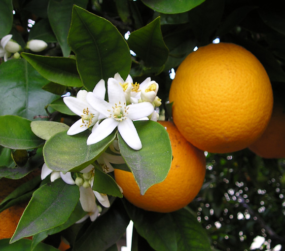
Orange is a color that sits between red and yellow on the familiar spectrum of visible light and on traditional color wheels. It is commonly produced by mixing those two primary pigments in subtractive systems, or by perceiving light in the wavelength band roughly between red and yellow; many people describe the sensation using the terms red and yellow. In everyday language, "orange" names both the color and the citrus fruit whose peel has become the color's archetype.
Image gallery
7 Images


Characteristics and sources
In nature, orange hues often come from carotenoid pigments such as beta-carotene, which tint fruits, vegetables and autumn leaves. In art and industry, orange can be produced by mixing pigments, by chemical dyes, or by lighting systems that emit the corresponding wavelengths. In digital design a commonly used web color labeled "orange" corresponds to a standard RGB/hex value used for consistency in screens.
History and name
The English name for the hue derives from the citrus orange fruit. Prior to widespread use of the fruit’s name in Europe, people sometimes described the shade as yellow-red. The fruit was introduced into northern Europe and then to places such as England during the early modern period; by the 16th century (the 1500s) the fruit and its name were established in English. The earliest recorded use of the word "orange" in English as a color term appears in the reign of English king Henry VIII in the early 1500s.
Uses and symbolism
Orange carries diverse meanings across cultures and contexts. It is associated with warmth, energy and autumn. Because of its high visibility it is widely used for safety and signaling—examples include high-visibility clothing, road signage and certain rescue equipment. Designers use orange to attract attention without the intensity of pure red; it is also a national and dynastic color in places where historical houses or movements adopted it for identity and flags.
Variations and distinctions
- Shades: ranging from pale tints (peach, apricot) to deep hues (burnt orange, russet).
- Contexts: pigment mixing (subtractive) differs from additive color mixing in light; an "orange" pigment and an "orange" light are not the same physical thing though they may look similar to the eye.
- Practical note: designers choose particular orange tones for readability, contrast and cultural appropriateness.
Because orange spans a wide set of perceptual and material realities, it appears across art, fashion, nature, navigation and branding. Its recognizability and practical visibility make it both aesthetically expressive and functionally useful in everyday life.
Questions and answers
Q: What is orange?
A: Orange is a color that is created by mixing red and yellow.
Q: Where does the name of the color orange come from?
A: The name of the color orange comes from the orange fruit.
Q: What was the color orange called before the introduction of the orange fruit to England?
A: Before the introduction of the orange fruit to England, the color orange was called yellow-red.
Q: When was the first recorded use of orange as a color name in English?
A: The first recorded use of orange as a color name in English was in 1512, in the court of King Henry VIII.
Q: Is orange the color of an orange fruit?
A: Yes, orange is the color of an orange fruit.
Q: What two colors are combined to create the color orange?
A: Red and yellow are the two colors that are combined to create the color orange.
Q: What is significant about the introduction of the orange fruit to England?
A: The introduction of the orange fruit to England led to the adoption of the name of the fruit as the name of the color.
Author
AlegsaOnline.com Orange (color) Leandro Alegsa
URL: https://en.alegsaonline.com/art/127923