Weather map
Overview of weather maps: types, main elements, station models, history, interpretation, uses in forecasting, aviation and marine navigation, and limitations of observational and model-based charts.
Overview
A weather map is a graphical tool that summarizes meteorological observations and analyses across a region at a particular time. It enables viewers to see patterns of pressure, temperature, wind, cloudiness and precipitation at a glance and supports both situational awareness and formal forecasting. For general background on atmospheric conditions see weather.
Image gallery
10 Images


Main elements and display types
Different maps emphasize different variables depending on scale and purpose. Common display types include surface charts, upper-air (isobaric) charts, temperature analyses, precipitation and radar composites, and satellite-derived fields. Typical map elements are:
- Isobars: contour lines of equal atmospheric pressure that reveal high- and low-pressure systems and the pressure gradient.
- Fronts: boundaries between air masses, shown as lines with symbols indicating cold fronts, warm fronts, stationary fronts or occlusions.
- Temperature values and gradients, often contoured as isotherms; see temperature.
- Wind barbs and streamlines showing speed and direction; consult wind guidance for interpretation.
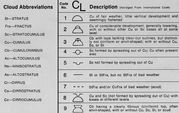
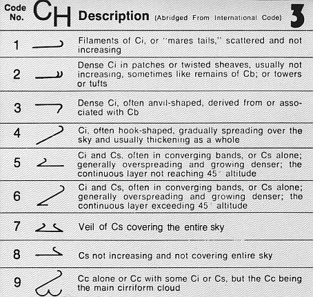
- Cloud cover symbols and cloud-type indications that help assess sky conditions; see cloud.
- Precipitation symbols or shading to indicate rain, snow or mixed types and rates; see precipitation.
Station model: compact observation coding
The station model is a compact, standardized depiction of conditions at a single reporting site such as an airport or synoptic station. It was developed to record many elements in a small space so maps can show dense networks of observations without excessive overlap. A typical station-model plot places temperature and dew point on specified sides of the marker, pressure and pressure tendency in standard locations, wind by barbs extending from the plot, cloud cover shown by shading of the central circle, and present-weather symbols nearby. The station model is a useful symbolic summary for both human analysts and computer displays; see the symbolic notation used at each reporting station.
Types of meteorological charts
Surface charts show features at or near the earth's surface, while upper-air charts (on constant-pressure surfaces) illustrate conditions at specified levels above ground, important for aviation and forecasting. Radar-derived maps show recent precipitation echoes and are useful for short-term warnings. Satellite composites provide cloud-top structure and motion, aiding analysis of large-scale systems and storm development. Analytical charts combine observations with numerical model fields to produce gridded products and derived quantities.
Practical uses
Weather maps support many practical tasks. Operational forecasting uses maps to identify developing lows, frontal movement and areas of strong temperature or moisture contrast. Aviation relies on surface and upper-air charts for winds, ceilings and icing risk; pilots and dispatchers consult these products as part of flight planning (pilots). Mariners use synoptic charts to avoid severe weather and plan routes. Maps are also central to public weather information and the issuance of warnings.
How to interpret common features
Start by locating pressure centers: highs and lows. In the Northern Hemisphere, wind flow is generally clockwise around highs and counterclockwise around lows; the reverse is true in the Southern Hemisphere. Closely spaced isobars indicate a strong pressure gradient and stronger winds. Identify fronts and note temperature and moisture changes across them; the warm sector between fronts often features different wind and precipitation patterns. Use station models to obtain exact local values for temperature, dew point, wind speed and present weather.
Limitations and uncertainties
Weather maps represent snapshots based on available observations and model analyses. Coverage and resolution vary by region: dense observational networks yield more detailed maps, while sparse data areas require interpolation and carry greater uncertainty. Temporal delays in reporting, instrument errors, or rapidly evolving mesoscale phenomena can reduce map accuracy. Modern interactive maps mitigate some limits by layering radar, satellite, and model output for near-real-time awareness.
Standards and modern production
International conventions and national meteorological services define plotting standards and symbol sets so maps are consistently interpreted. Today, computer graphics routinely generate station models, contours and layered visualizations from automated feeds and numerical model output. Analysts still use manual plotting and subjective interpretation when examining rapidly changing or complex situations.
Further resources
For technical symbol keys, coding conventions and training materials, consult national weather services and meteorological manuals that explain plotting rules, station-model fields and chart analysis techniques for forecasting and aviation. Useful starting points include official guides on weather, detailed notes on temperature analyses, the symbolic station-model system, documentation about each reporting station, pilot-oriented briefings for aviation, and topic pages on wind, cloud and precipitation.
Questions and answers
Q: What is a weather map?
A: A weather map is a tool used to show facts about the weather quickly.
Q: How long have weather maps been used?
A: Weather maps have been used since the mid-19th century for study and weather forecasting.
Q: What do some weather maps show?
A: Some weather maps show differences of temperature and weather fronts.
Q: What is a station model?
A: A station model is a symbolic picture showing the weather at a reporting station.
Q: Who made the station model and why?
A: Meteorologists made the station model to put down many weather elements in a small space on weather maps.
Q: How do computers assist in drawing a station model?
A: Computers draw a station model for every place of observation.
Q: What can a complete station-model map show people?
A: A complete station-model map lets people study patterns in air pressure, temperature, wind, cloud cover, and precipitation.
Related articles
Author
AlegsaOnline.com Weather map Leandro Alegsa
URL: https://en.alegsaonline.com/art/107038
Sources
- encarta.msn.com : "Chart"
- ccc.atmos.colostate.edu : Introduction to Drawing Isopleths.
- indiana.edu : "Francis Galton (1822-1911)"
- webexhibits.org : "Daylight Saving Time"
- celebrating200years.noaa.gov : "An Expanding Presence"